CLIENT
Banco Montepio
SCOPE
Brand purpose
Brand positioning
Brand values
Brand story
Brand Identity
Brand guidelines
Brand ID system
Motion design
Digital design
Signage design
Business tools
Retail environment
Brand experience
Advertising campaign
Social media management
Brand activation
Brand Implementation
Human values
that grow with you.
In 2019, Banco Montepio (previously known as Caixa Económica Montepio Geral) aimed to become more independent form its strong connection to Associação Mutualista Montepio. It’s new purpose was to lead banking development renewing its brand and innovating within the services it provided.

Banco Montepio needed to reinforce its position and communicate its strong commitment to making a difference in the life of its Clients as a more human and empathetic devoted to showing it understands the needs, ambitions and challenges that Portuguese families face. A bank whose sustainable vision for Portugal and the world works with and for everyone.
BRAND PURPOSE
Improve the lives of all portuguese families.
The bank that makes a difference in the lives of families, companies and social institutions, by helping them to face each new challenge with renewed confidence and achieve goals in a dedicated and responsible way.
CHALLENGE
In order to reinvent the image of a 175-year-old bank, refreshing the bank's brand was critical in representing its mission and new ambition that inspired a new vision for the institution. Naturally evolving the existing brand by simplifying its structural elements, rejuvenating the tone of voice making it more relevant to its target audience by making it more assertive and functional was key.
SOLUTION
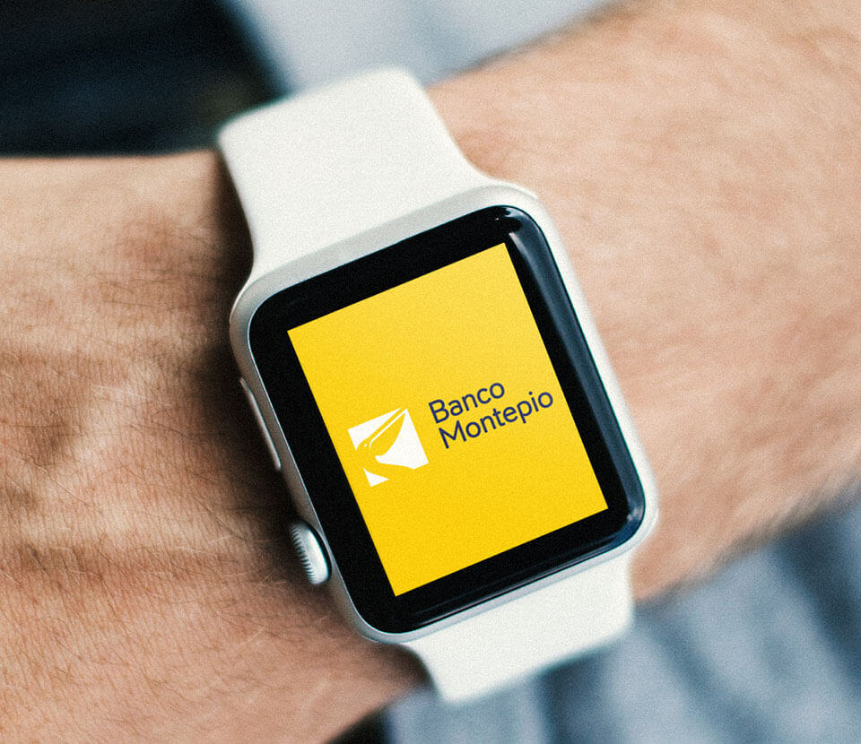
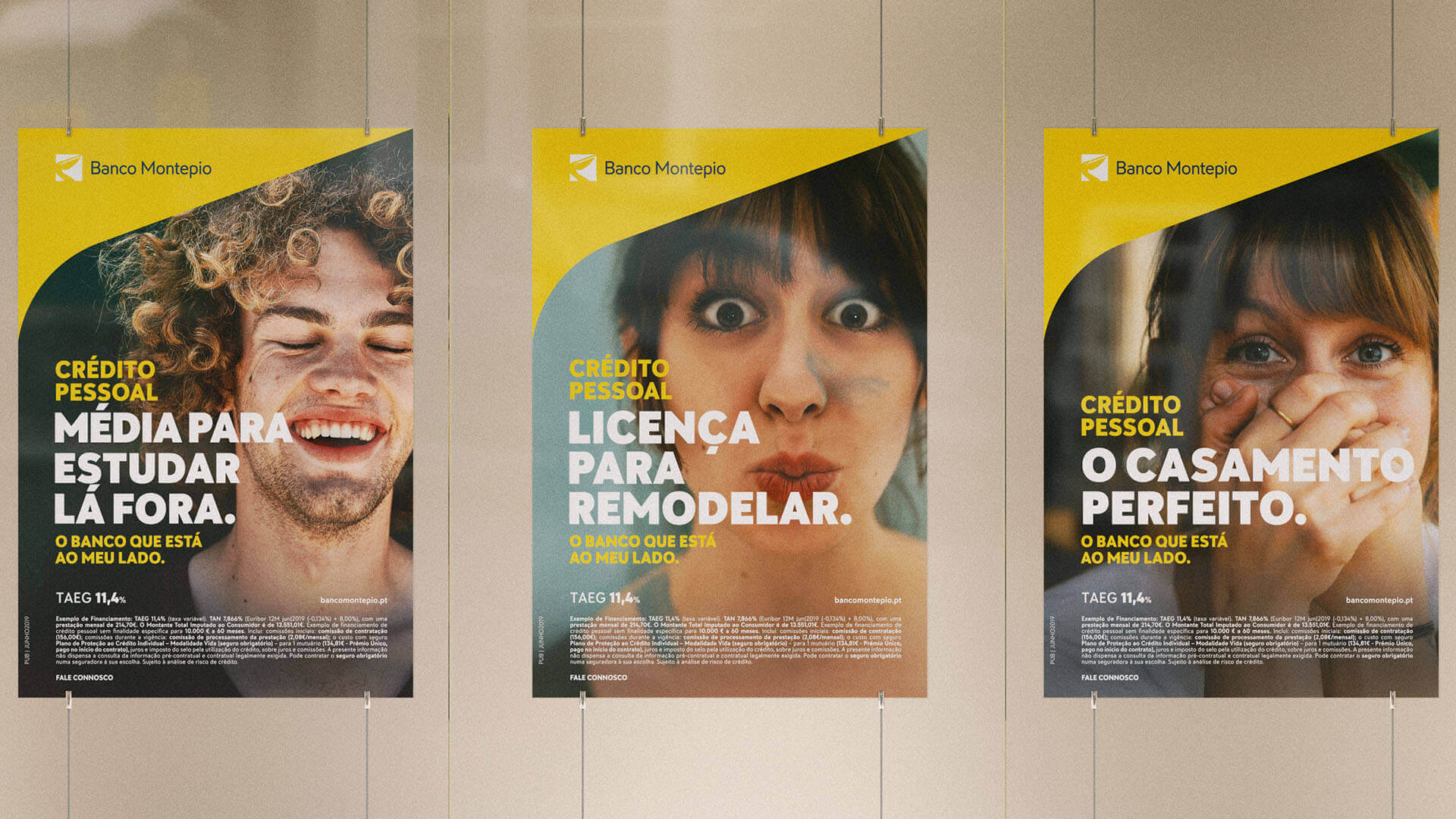
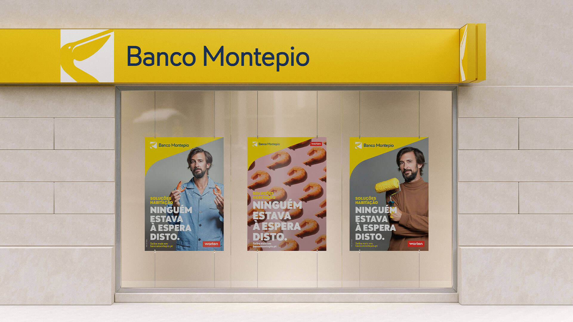
With simple, accessible, empathetic and surprising language, Banco Montepio's image was reinvented with a new visual identity and tone of voice reflecting a new attitude. The new brand encompasses a renewed bank ready to lead the banking transformation projecting its desire to be close to Portuguese families, companies and social institutions, accompanying them in every moment of their lives.
Values that grow with you.
Rebranding
The mutualist concept represented in the previous logo gave place to a grown-up, strong, and confident pelican that now raises its head towards the future. Communication reinforces this attitude, and embodies brand values: optimism, hope for the future, confidence, security, and determination.
Color
Based on the brand's previous identity and history, the chromatic universe is an evolution of the colors yellow and blue. Considering that they are already part of its personality and have conquered its territory, Torrado Yellow and Navy Blue color tones give a fresher and more open energy to the brand.
Legacy Blue
Inherited from the bank's history, it conveys solidity, confidence, and security and reinforces the bank's character as an institution.
Optimistic Yellow
A new yellow that reflects closeness, optimism, energy, and breadth of vision.
Tipografia
Infoma

Communication
The communication layout reflects the vision of the future expressed in the pelican pose and with simple messages about actual ambitions and desires reveals a bank that knows the moment of life of each family member.
Advertising
“Nobody expected this” was the concept created to refresh the brand's communication with an unexpectedly more fun and surprising tone.
A revolution in the brand itself, making it more appealing, contemporary, and legitimate, which projected the national company as a major player in the global market with the capacity to grow into an industry of the future.


Next project