CLIENT
FUSION-FUEL
SCOPE
Brand Strategy
Brand Purpose
Brand Story
Brand identity
Brand Architecture
Brand ID System
Business Tools
Exhibition Design
A human brand
to fuel humankind's future.
To prepare the brand for the global market, we evolved Fusion Fuel's image and created a challenger brand in the green hydrogen market during a period of affirmation and international expansion, capable of attracting investors and transmitting a clear vision of the value proposition and its competitive factors.

A brand that reflects a promising Portuguese company worldwide, with the capacity to grow and be oriented towards an industry of the future, competitive, inspiring, and mobilizing.
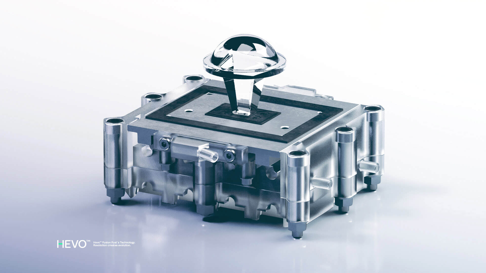
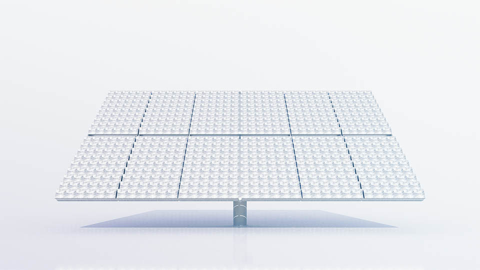
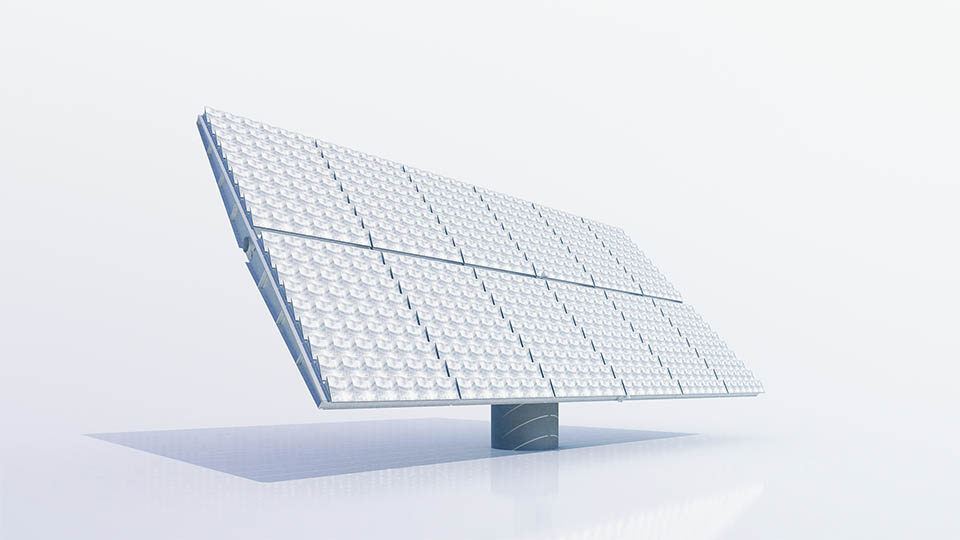
Above all, it must be capable of capitalising on the innovation, capacity, and pioneering technology that efficiently generates green hydrogen from renewable energies with no carbon emissions.
BRAND PURPOSE
Produce clean and unlimited energy available to all, safeguarding the planet and future generations.
MISSION
Provide innovative green hydrogen solutions at an affordable price, contributing to industry transformation and reducing carbon emissions.
SOLUTION
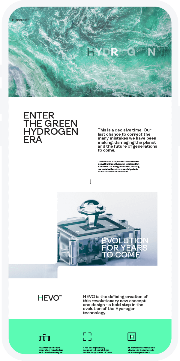
The new identity reflects the nature of hydrogen's tangible but invisible power, through the "H" as the first symbol of the periodic table, representing green hydrogen and the "H" of humanity, whose protection and preservation is the ultimate end of green hydrogen production. The new signature reinforces FUSION-FUEL's promise and its purpose: to build a greener energy future and a more sustainable world as a provider of infinite energy, opening up unlimited possibilities for future generations.
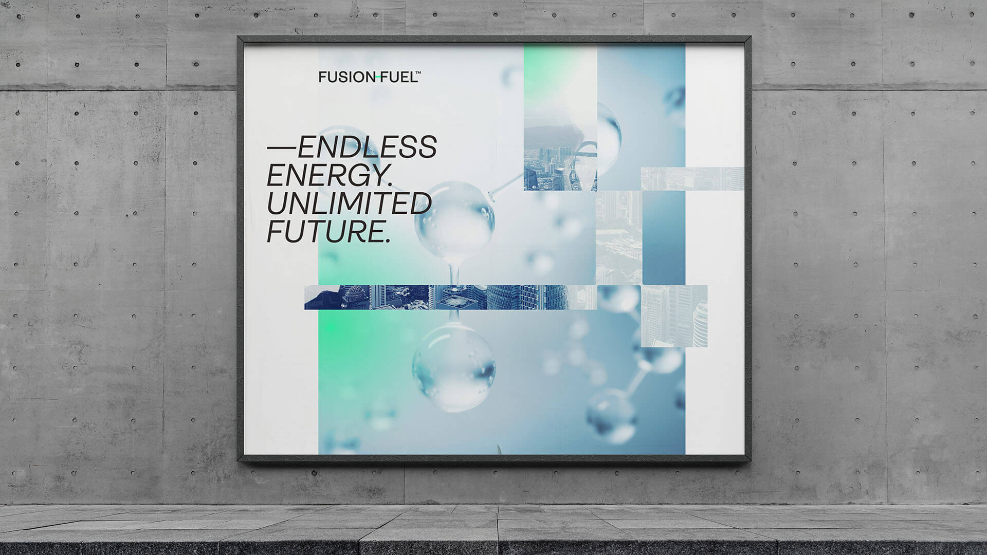
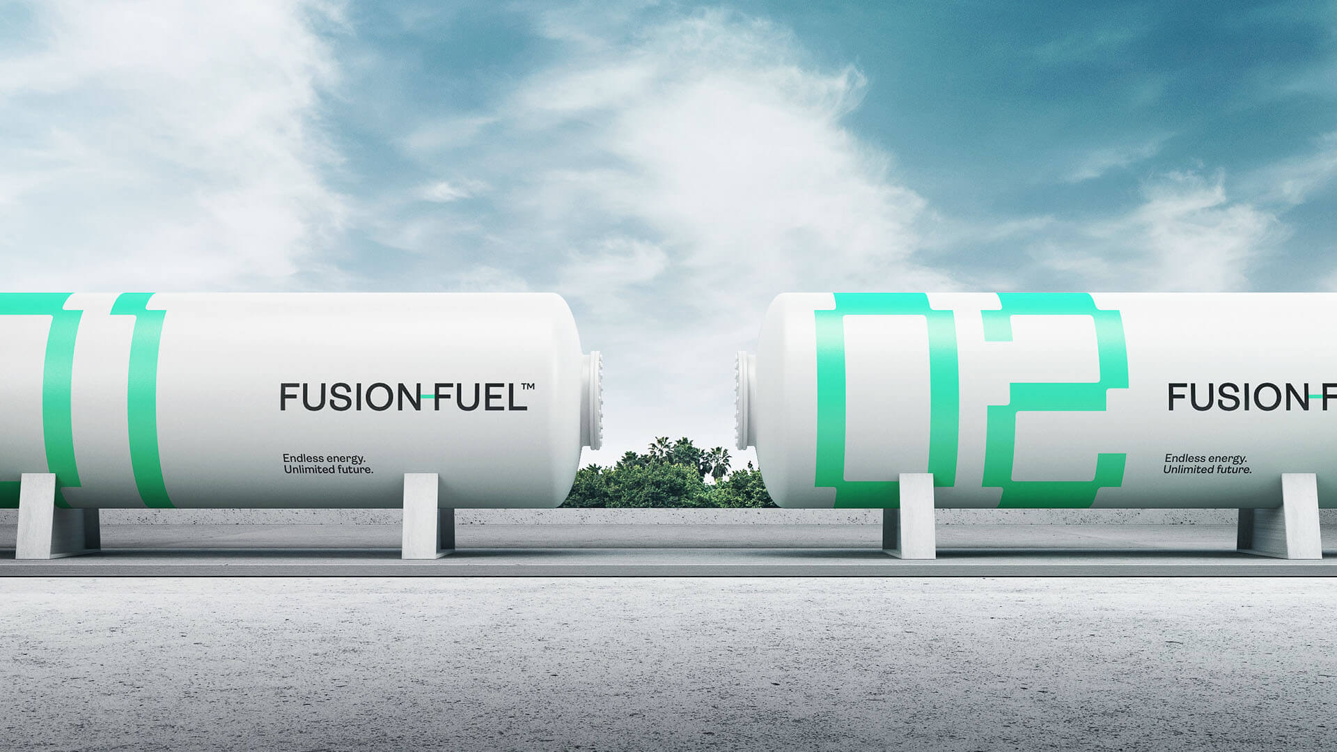
Endless energy. Unlimited future.
H as a symbol
of the hydrogen
revolution
H, the first symbol of the periodic table, H of green hydrogen, and symbolically representing Fusion Fuel's focus of action.
H for humanity, whose protection and preservation is the ultimate goal of green hydrogen production.
H, which, due to its shape, also symbolically represents a bridge between technology and sustainability.
Color
Translucent yellow (sun), blue (water), and green (nature) are colours that represent the fundamental elements needed to produce green hydrogen while protecting the environment at the same time.
Tipografia, simbolicamente representa
também uma ponte entre tecnologia e sustentabilidade.
Custom numbers
The graphic device uses the
hyphen form to expand the
brand expression. A useful tool
that allows you to build a unique
visual language by creating
spaces and dynamic forms to
respond to all the brand's
communication needs.
The iconographic language of the brand is born from the hyphen, which takes on the main color of the brand, and ensures proportionality in the design of all icons. The curved corners in the shapes give them balance and personality.
Sub-Brands
The "H" in the beginning of each name guarantees that every technology created by FUSION-FUEL is seen as the result of the brand’s same vision. This first letter should always be followed by a word that points to the benefit of the technology.
HEVO is the defining creation
of this revolutionary new design
- a bold step in the evolution
of electrolyzer technology.
Everything was designed to involve Fusion Fuel's stakeholders in this hydrogen revolution, from the digital to the physical, from the speech tone to the visual universe, with environments that reconcile technological advances and nature, as seen in the message, colours, and iconography.
A revolution in the brand itself, making it more appealing, contemporary, and legitimate, which projected the national company as a major player in the global market with the capacity to grow into an industry of the future.


Next project