CLIENT
PARQUE TERRA NOSTRA
SCOPE
Brand Strategy
Brand Purpose
Brand Story
Brand Architecture
Brand ID System
Motion Design
Business Tools
Retail
Merchandising
Go to Market Launch and Communication
The enchanted legacy.
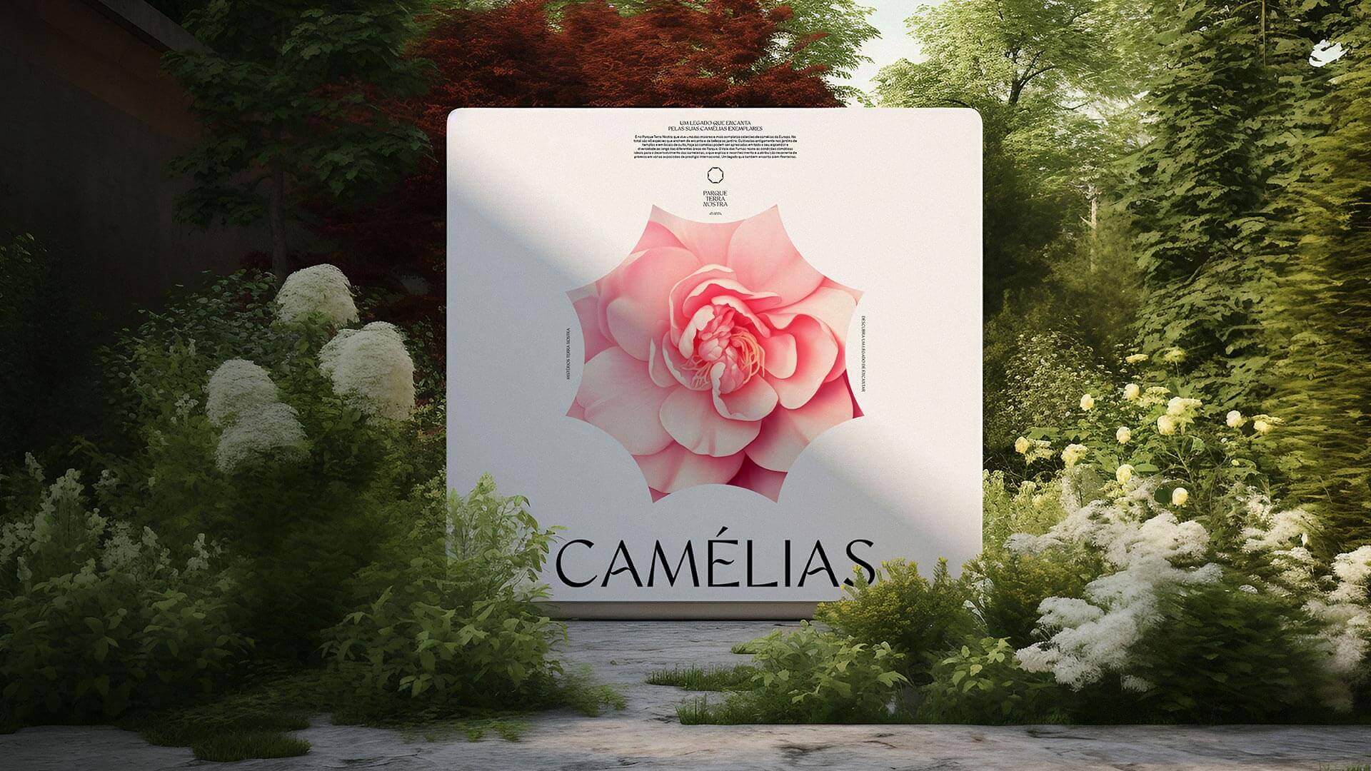
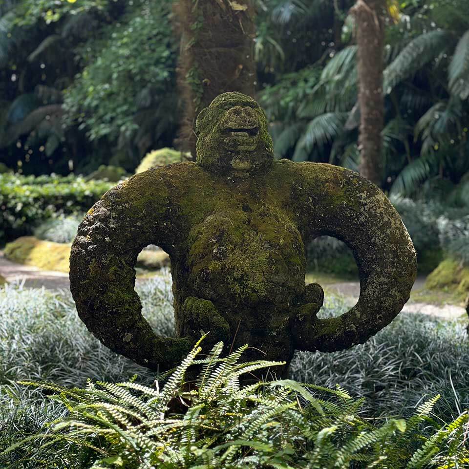
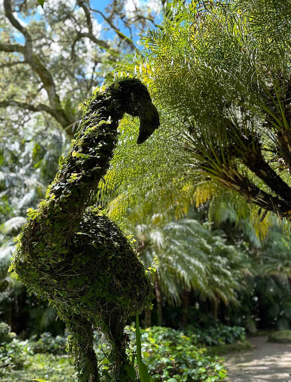
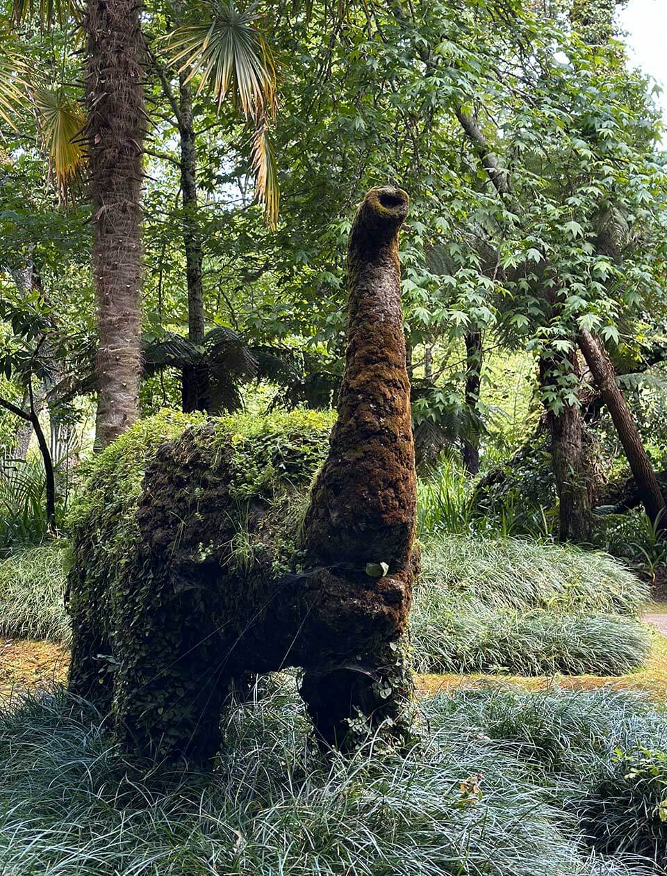
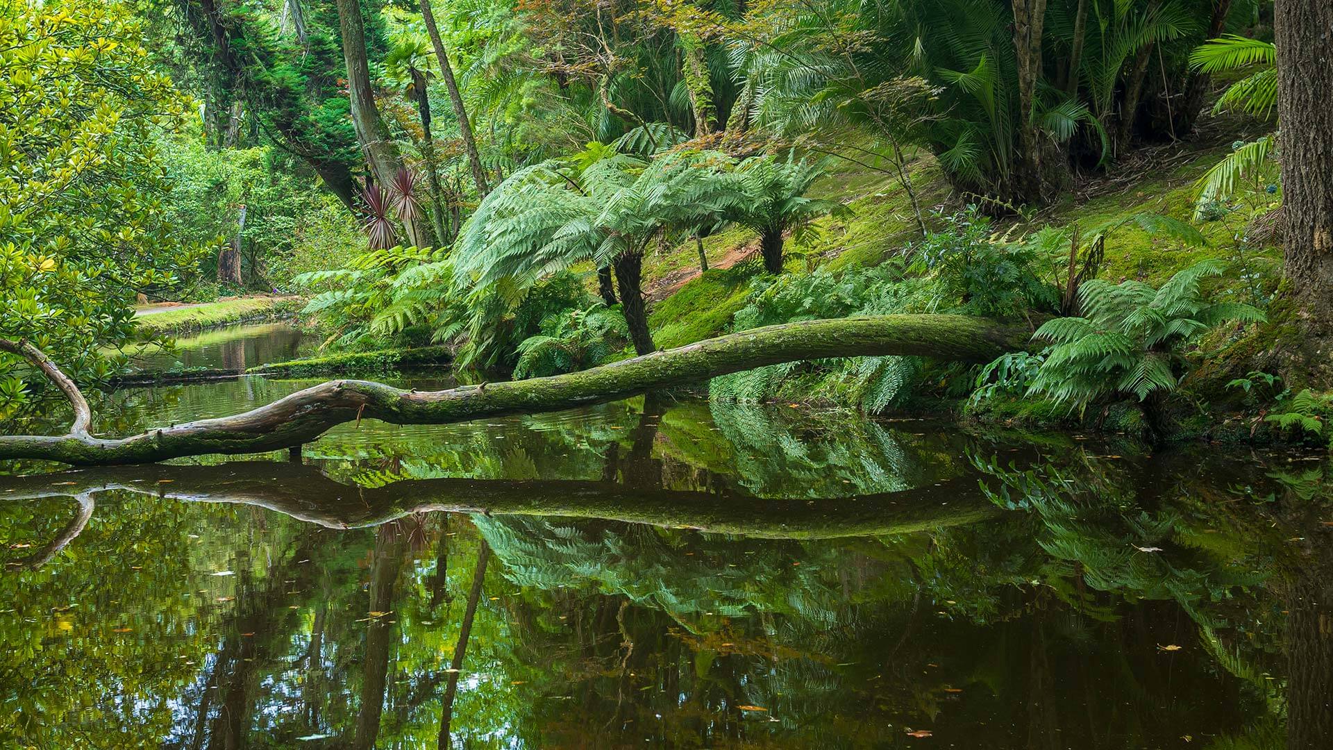
_Terra Nostra Park (PTN), located on São Miguel Island, Azores, is internationally renowned for its beauty and botanical splendour and mentioned in magazines such as Forbes and Condé Nast Traveller. Founded in 1780, this botanical garden was acquired by the Bensaude Group in 1930 and is home to one of the world’s largest camellia collections. This is an unmissable tourist attraction visited by over 300,000 people, including scientists and researchers, every year.

But Terra Nostra Park goes beyond a garden, becoming an entire ecosystem of which the Park is a unified symbol.
BRAND PURPOSE
Enchant each and every visitor through an immersive experience in a unique natural and cultural world legacy.
MISSION
Caring and preserving a natural legacy that results in a cultural treasure of a botanical and biological nature with high sustainable value, making one of Azores’ most precious jewels accessible and continuously able to enchant and amaze everyone who visits the Park. Share the best of the Azores with everyone.
CHALLENGE
Terra Nostra Park is in the process of reorganising and modernising its main areas and support infrastructures. This project not only aims to enrich the experience of visitors, but also to increase the recognition and quality of the natural and cultural heritage that the Park represents. The need to rebrand reflects this transformation aiming to capture the history of the Park, the passion of those who preserve it and its splendorous nature. A new identity that reflects the natural wealth of the Park valuing its ecosystem like the Terra Nostra Garden Hotel which promotes quality and excellence.

In addition to positioning the brand as a reference in leisure and well-being, it is essential to reinforce its scientific and sustainable value. The new identity should have purpose and meaning, in line with the importance the Azores gives to preserving its natural botanical and cultural legacy simultaneously considering a plural and systemic experience, where the Park is the center of a vibrant and diverse ecosystem. With a global strategic plan, the intention is for Terra Nostra Park to attract more visitors, but also to inspire nature conservation, reinforcing sustainable tourism in the Azores and increasing its relevance on a global level.

Terra Nostra Park’s rebranding should make everyone, from the local community to global environmentally concerned citizens, including the scientific community, feel at ease to discover, understand and protect this natural treasure.
SOLLUTION
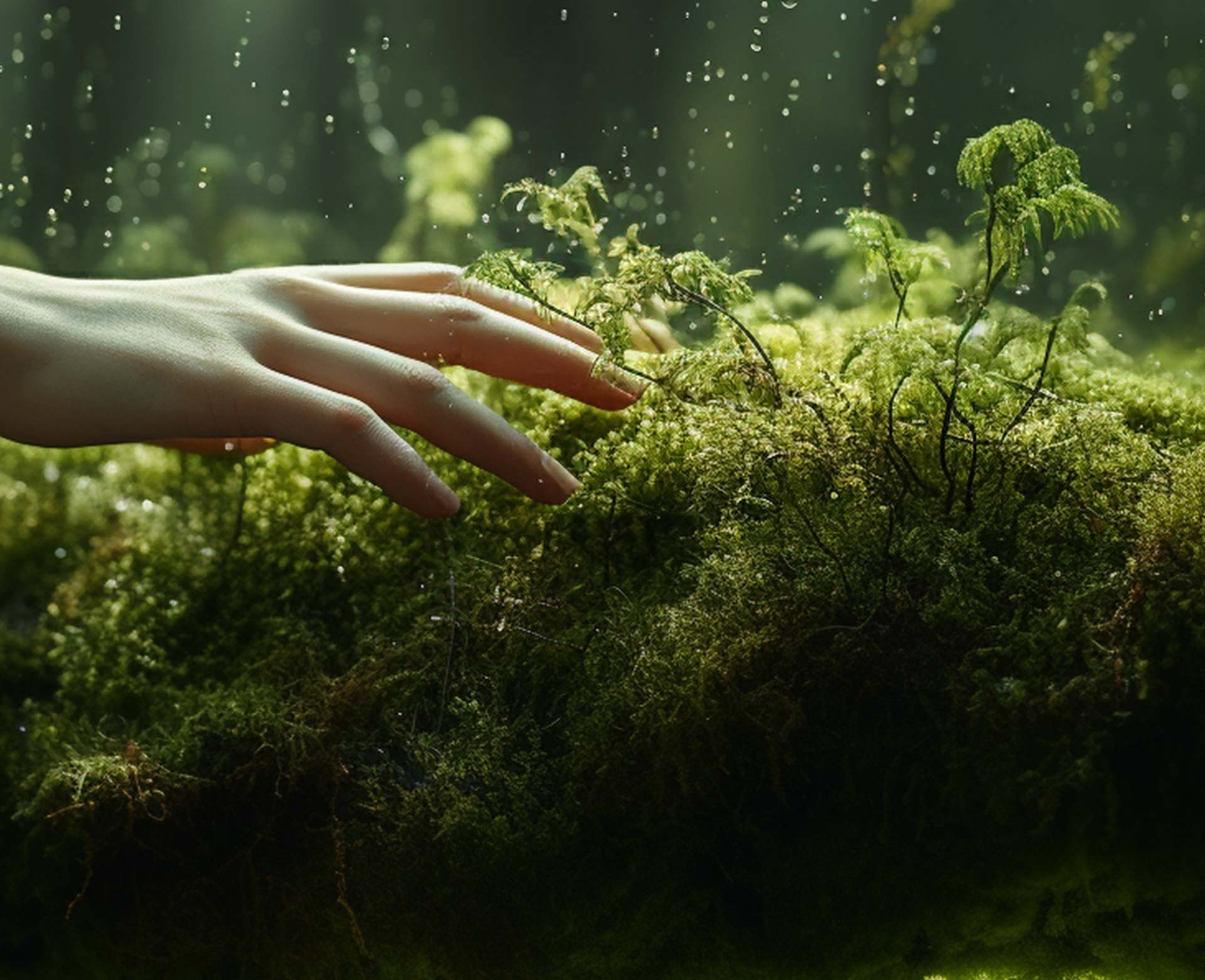
Terra Nostra Park is a legacy that enchants generation after generation, mesmerising every visitor and guest. This extraordinary beauty inspired the creation of the new identity celebrating the park’s rich history and botanical nature. Our approach to this project focused on the elements that make this park unique: its biodiversity, iconic architecture and deep respect for nature.

Our vision was to create a brand that makes the park’s central elements stand out reinforcing its exclusiveness and individuality whilst staying true to its botanical nature. It was essential for the brand to provide a pluralistic experience where the park is the center of a constantly evolving live ecosystem; an organism that grows guided by nature’s cycles and its human legacy.

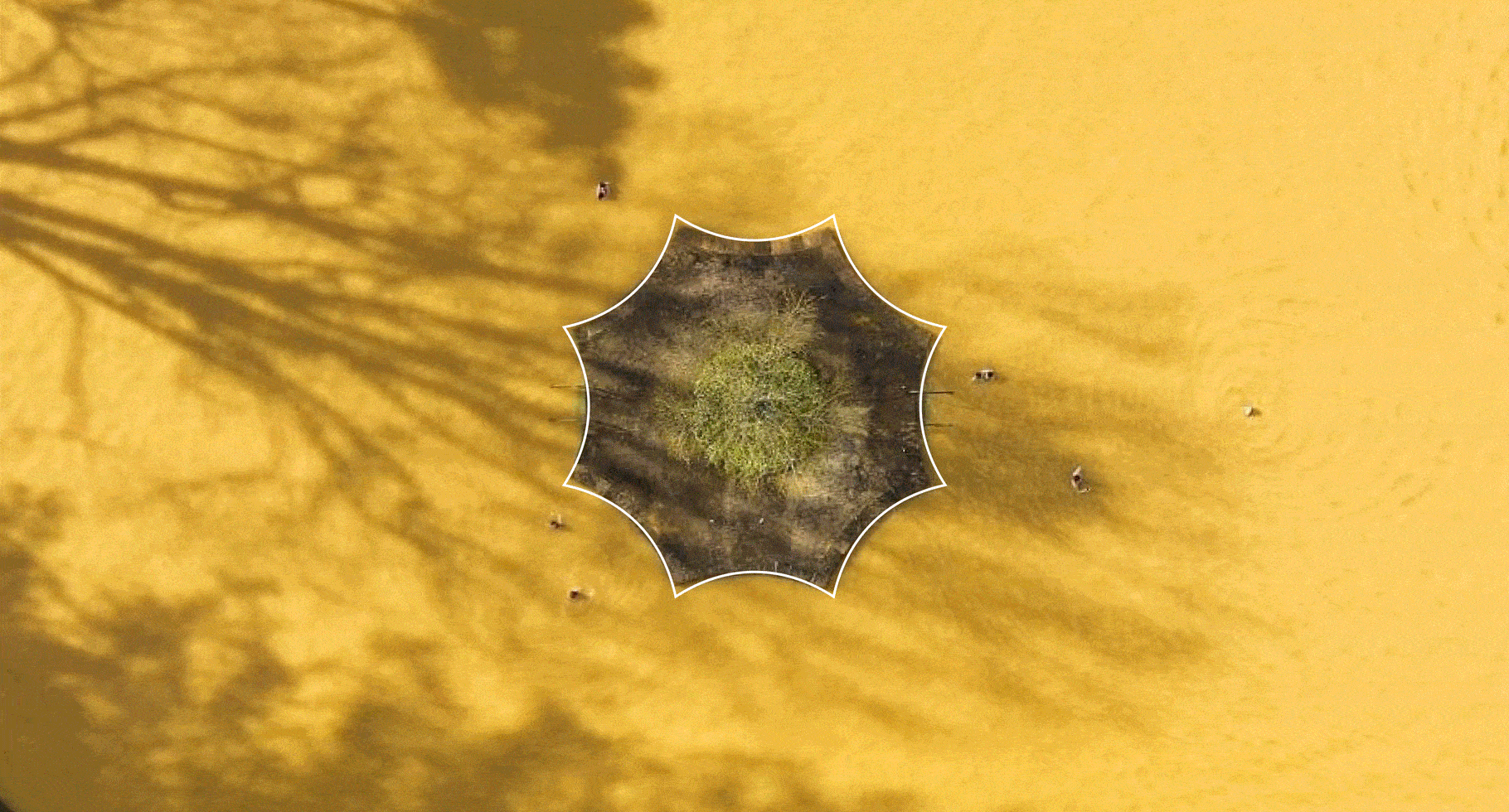
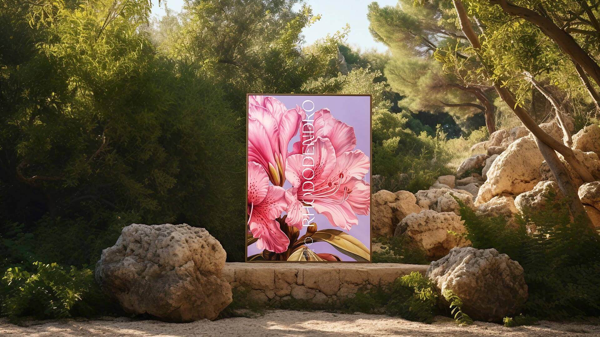
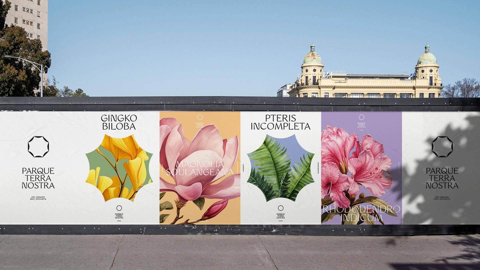
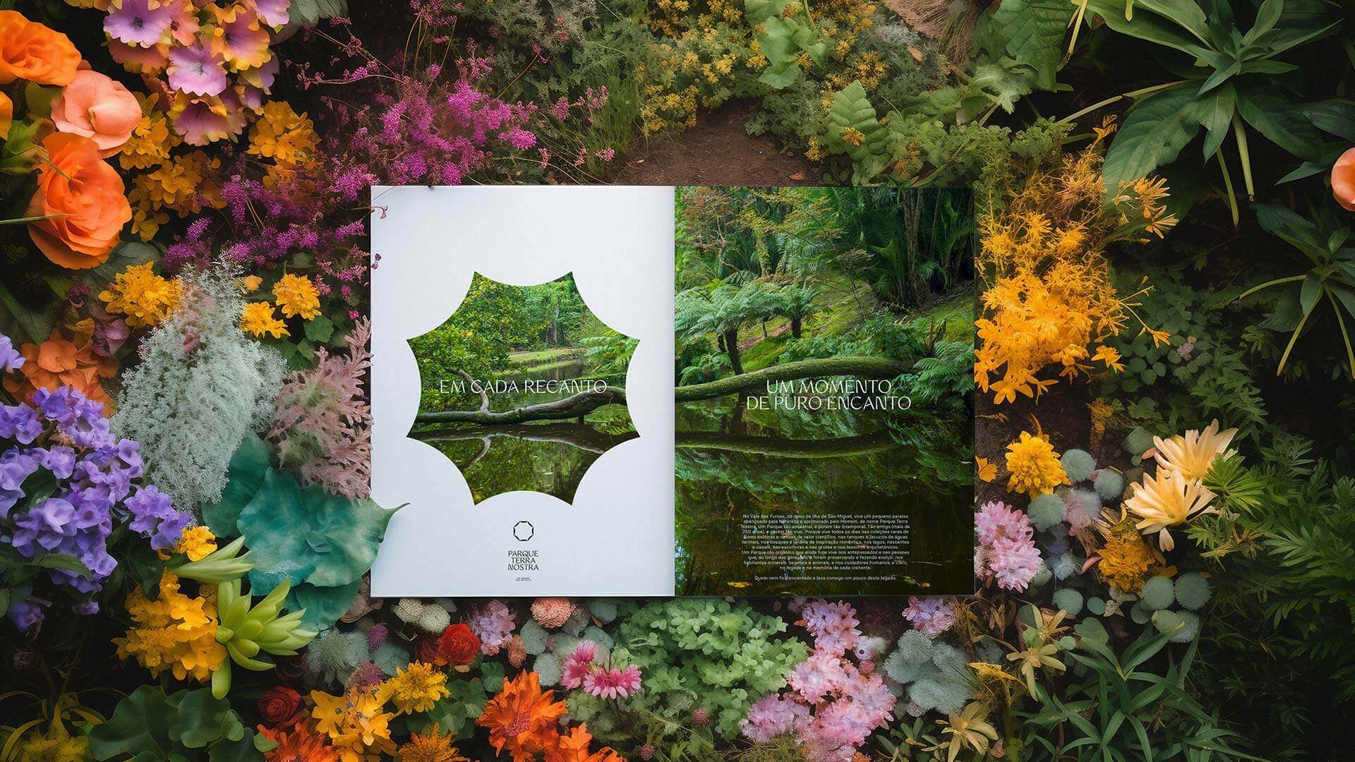
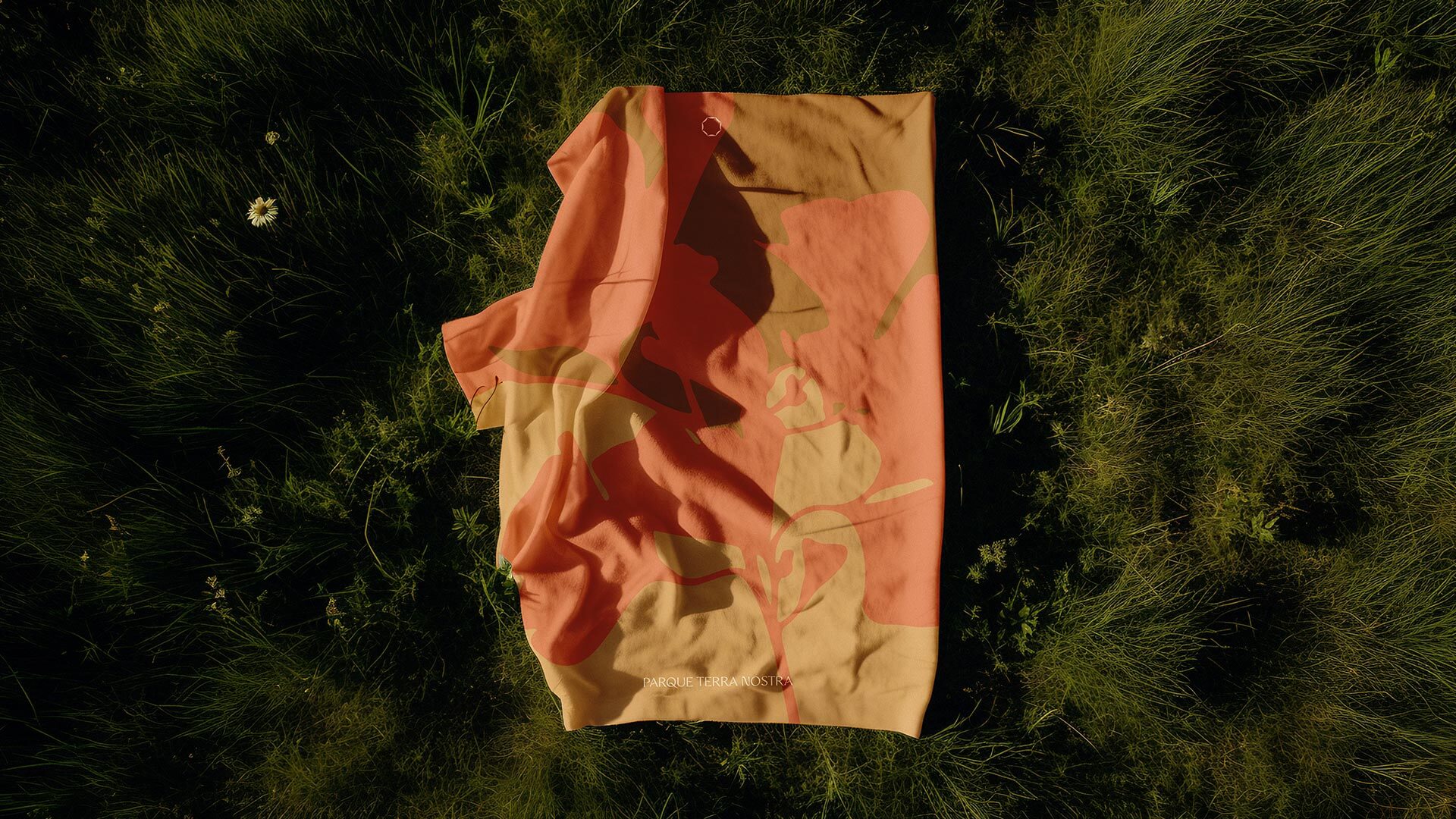
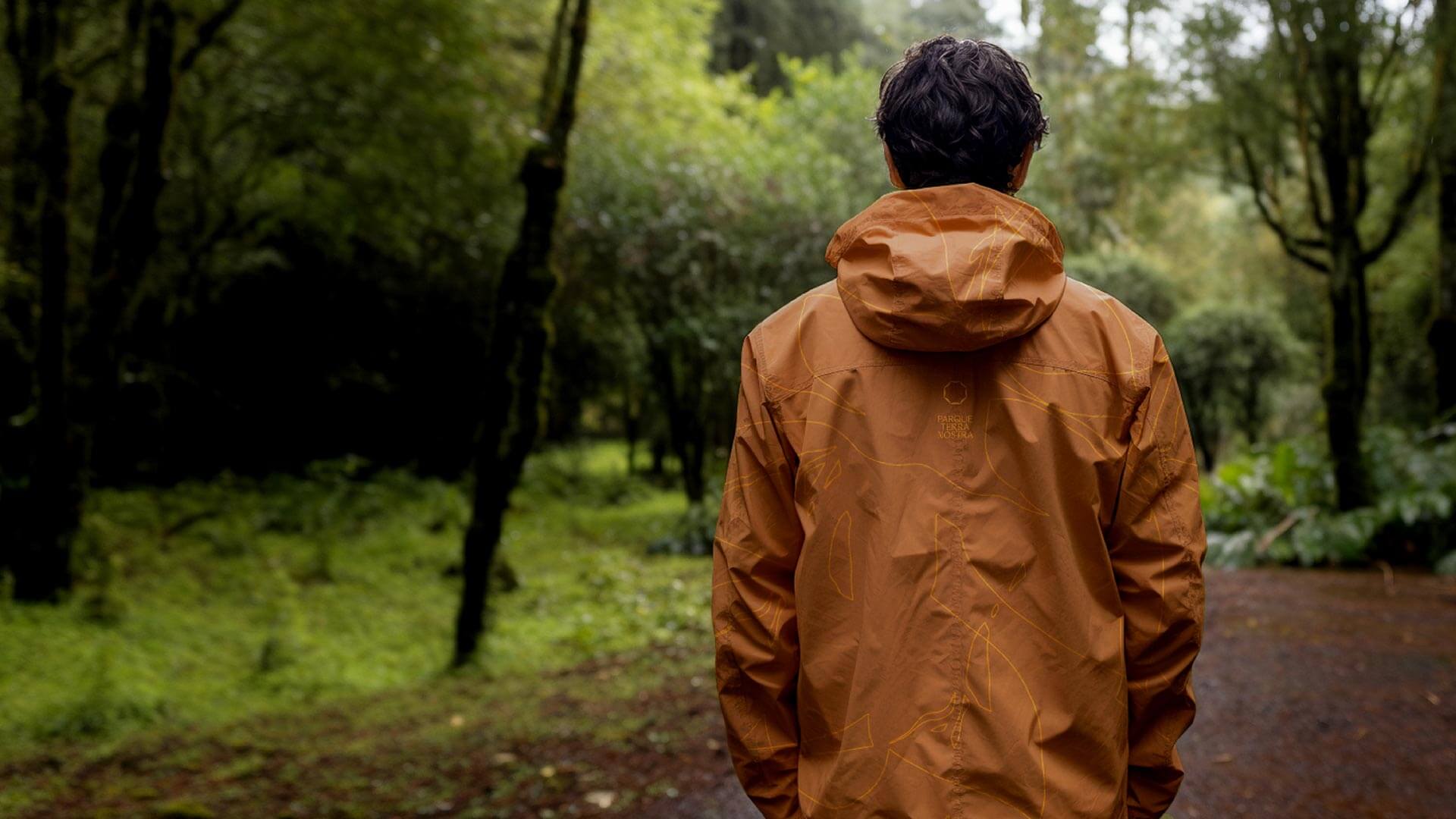
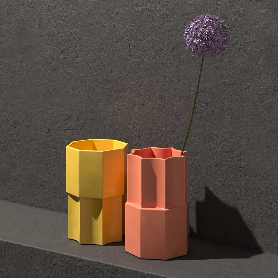
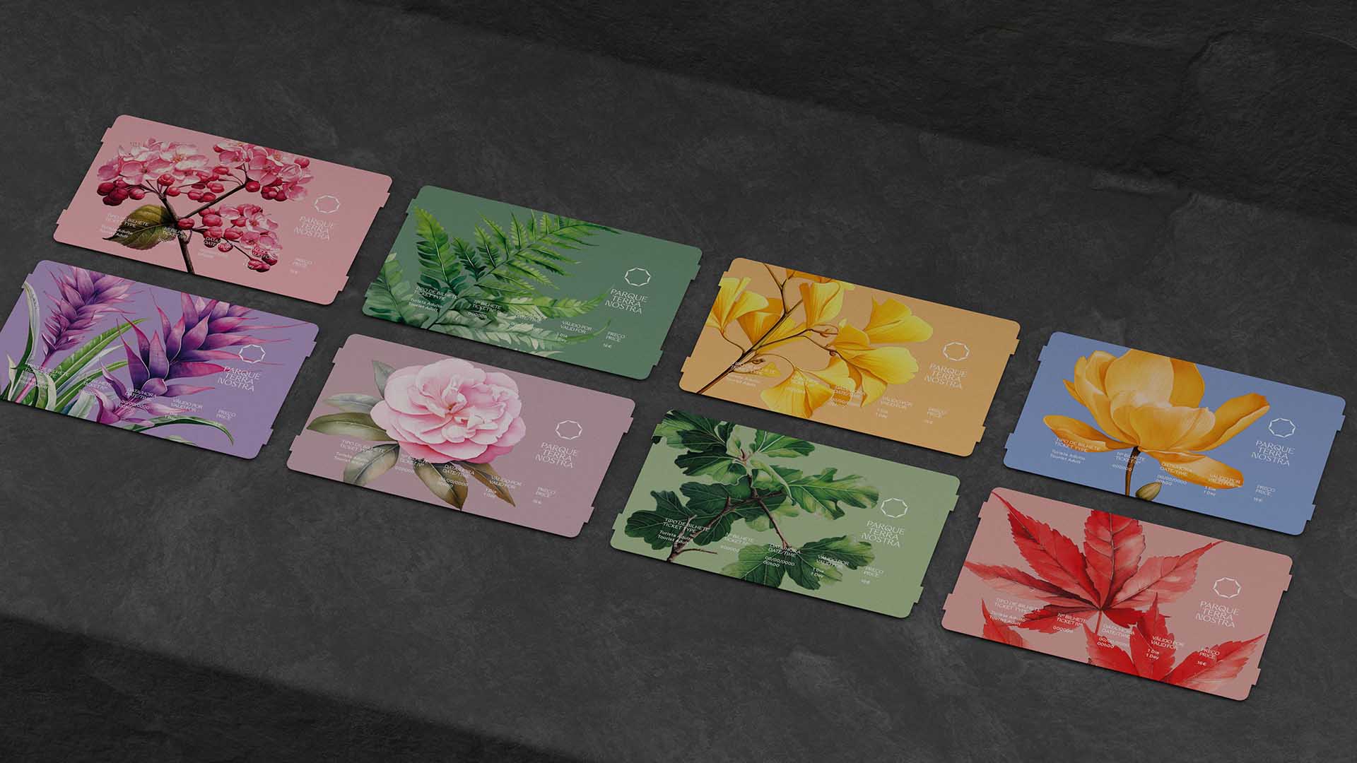
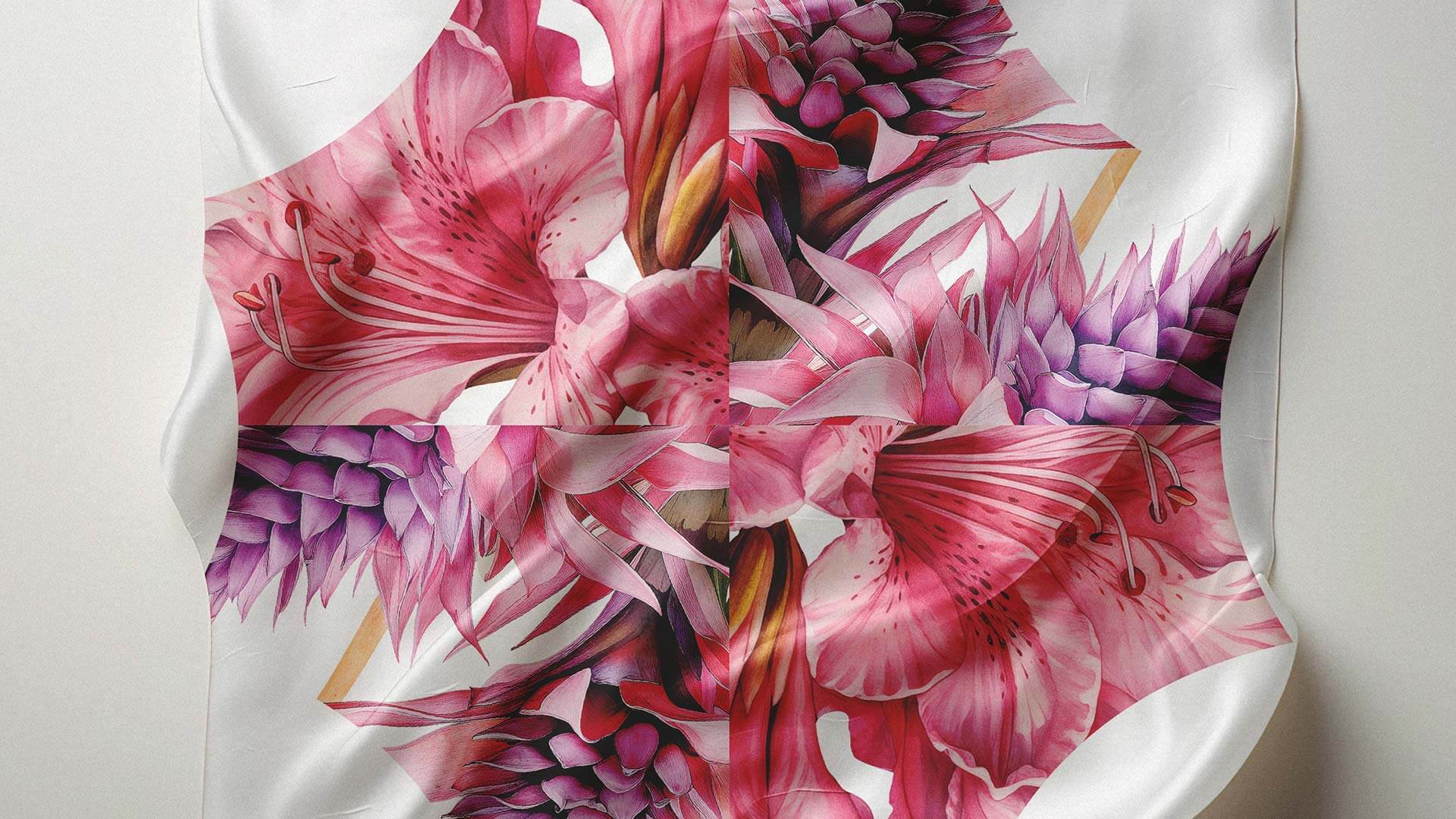
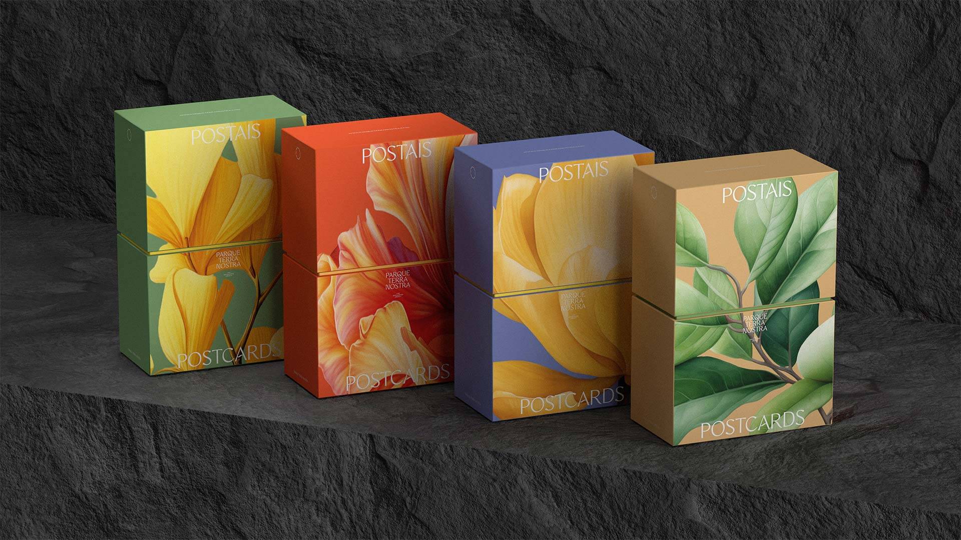
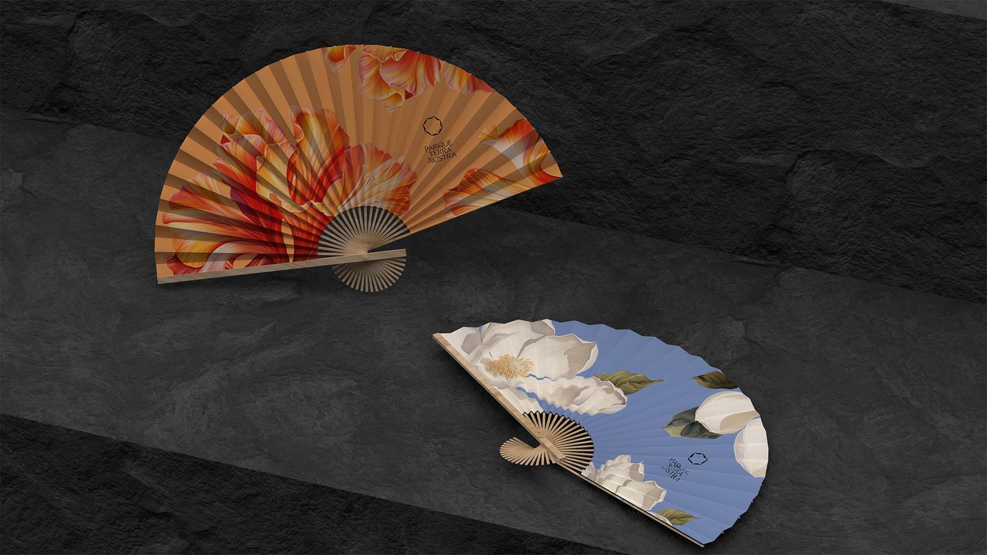
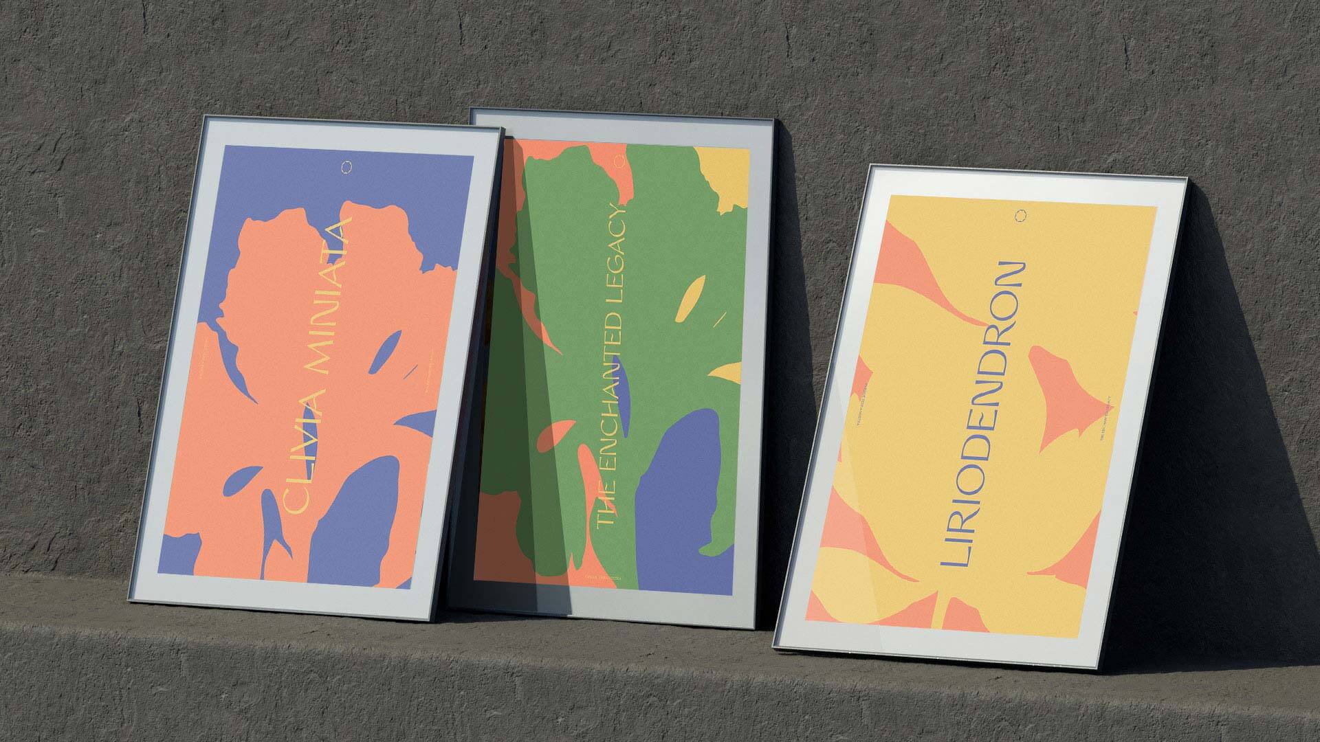
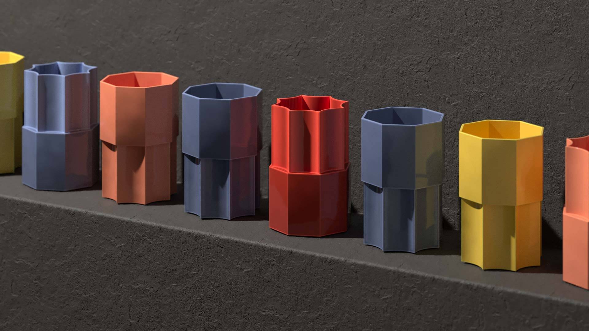
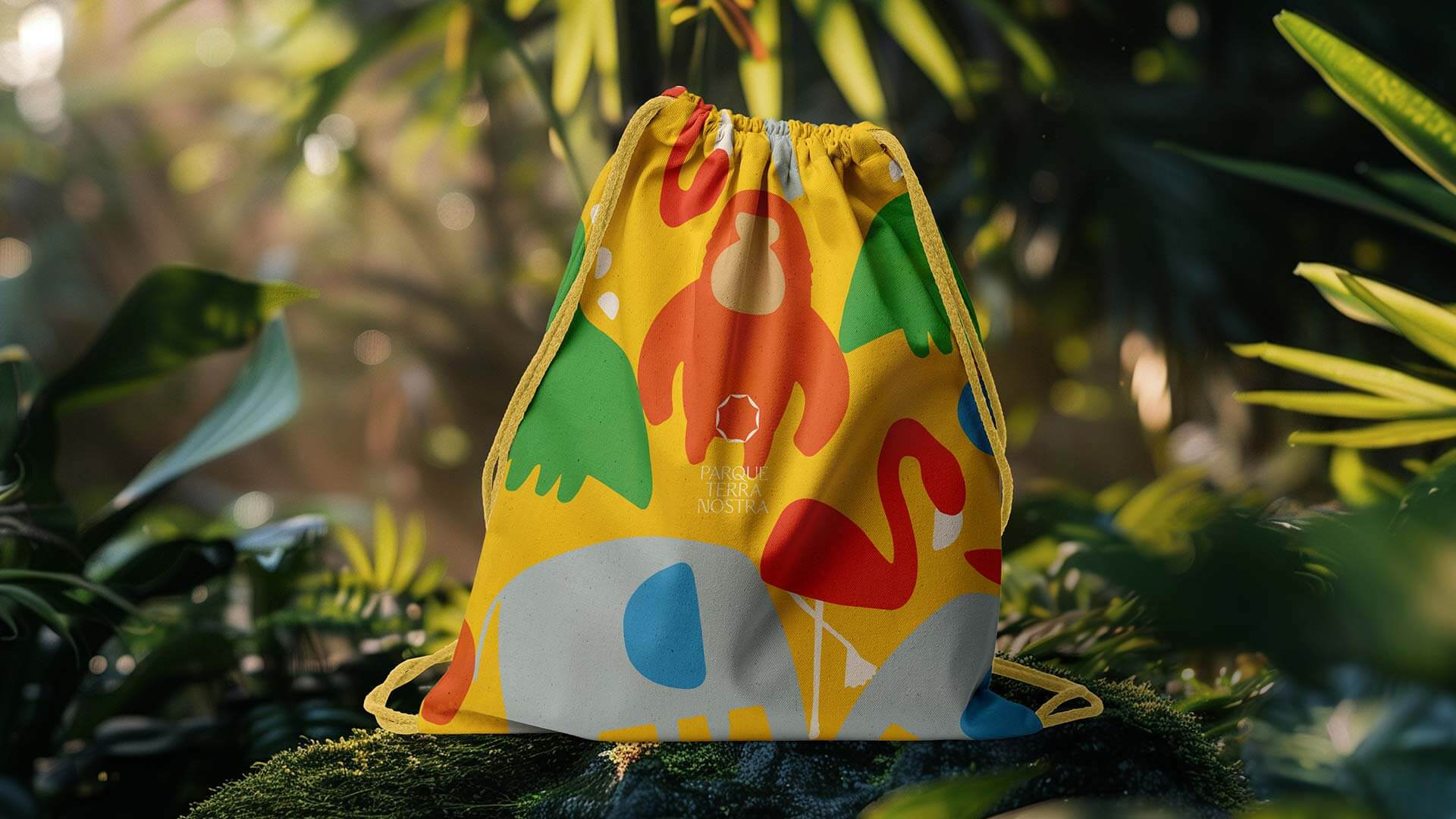
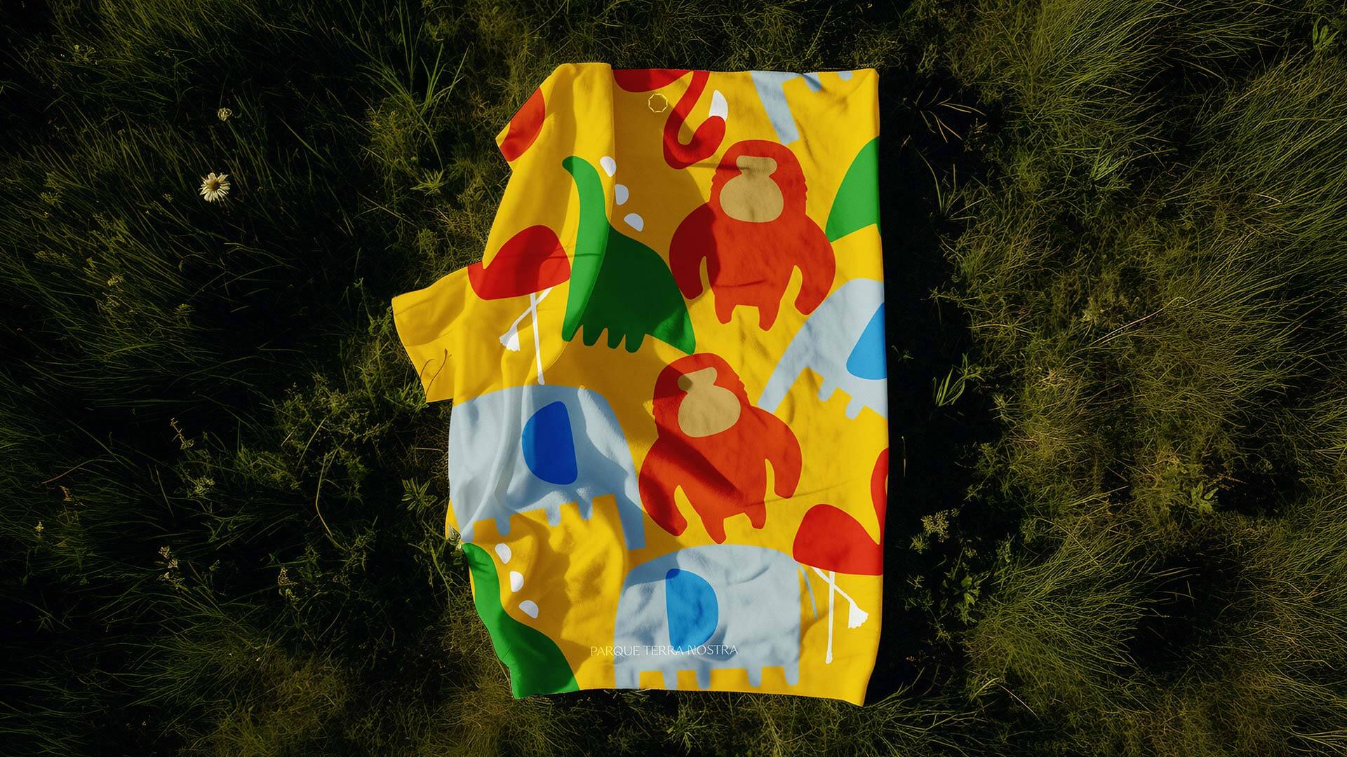
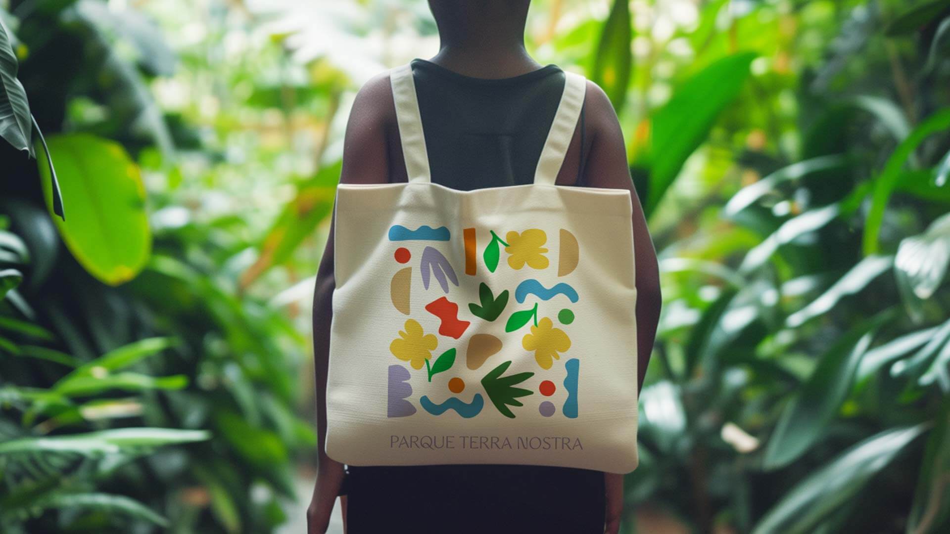
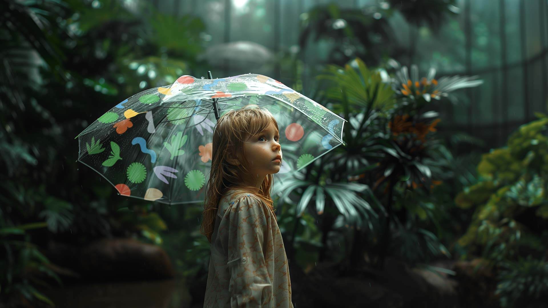
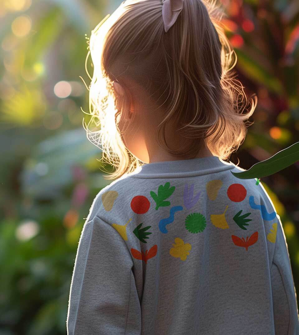
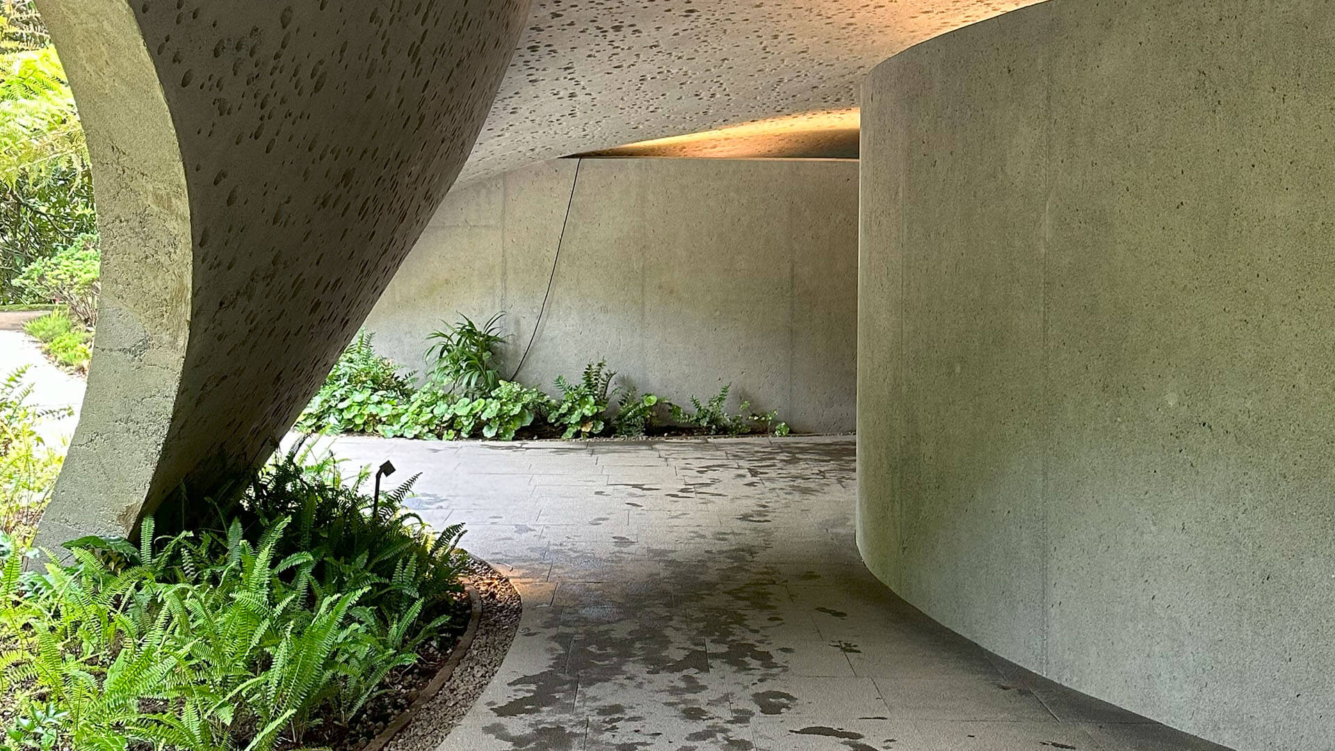
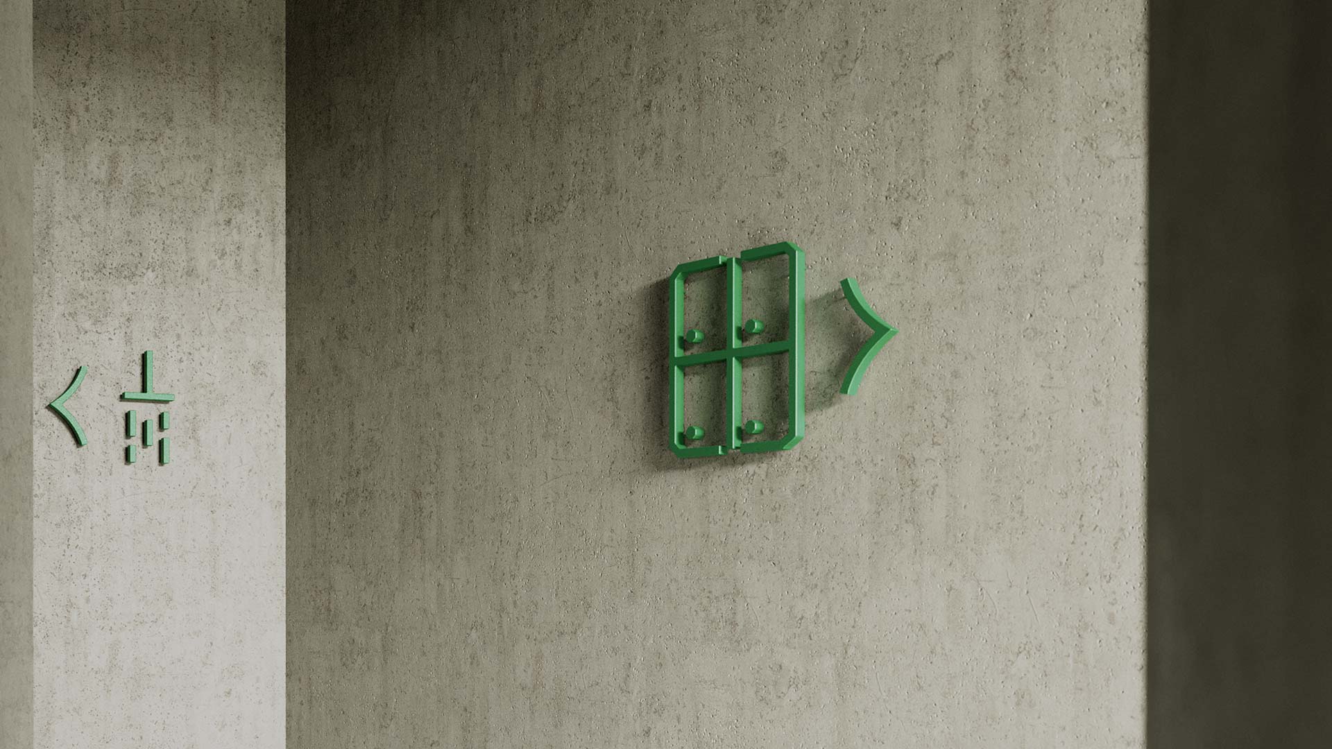
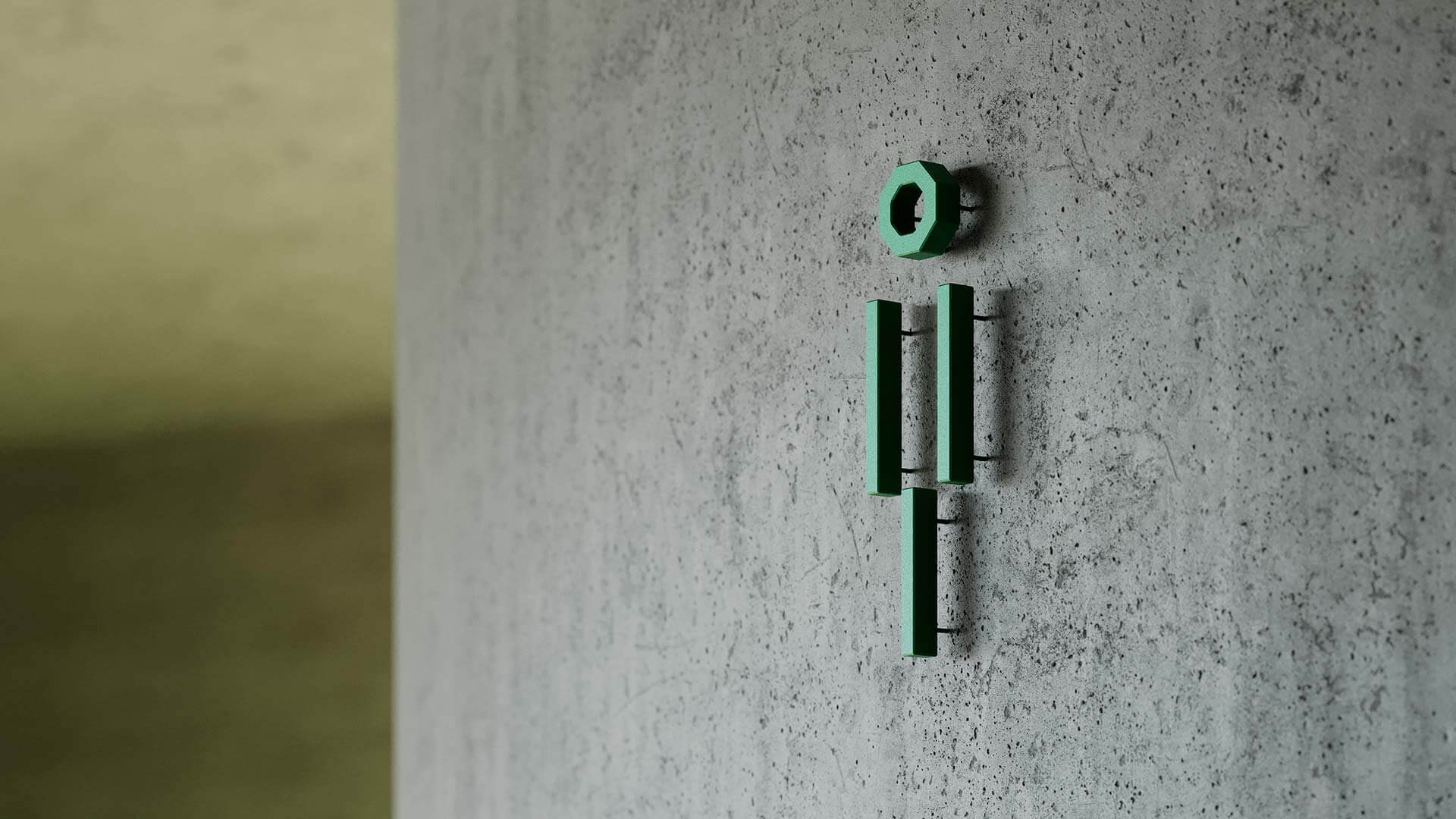
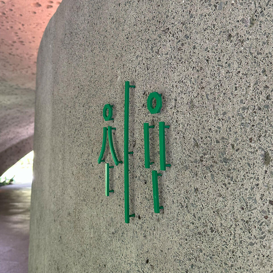
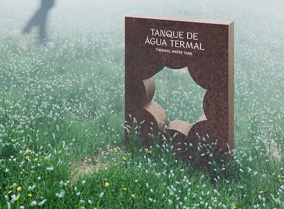
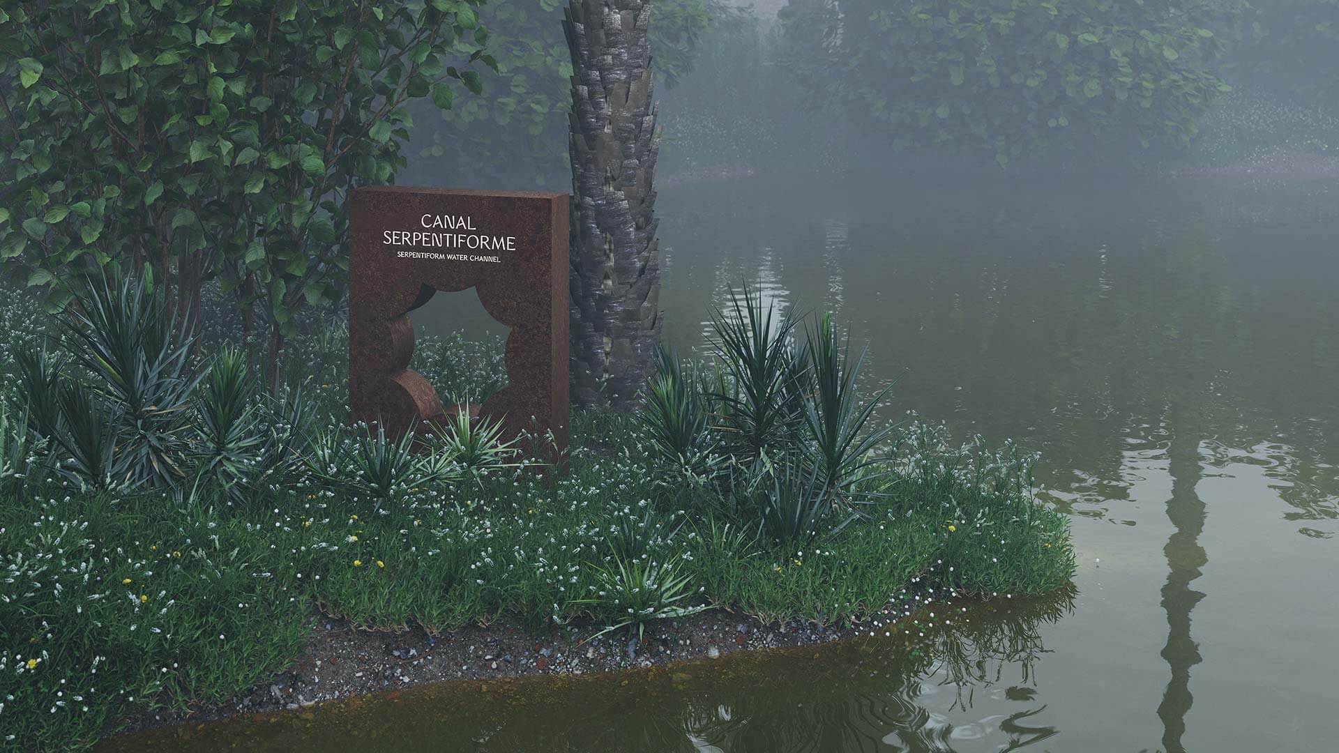
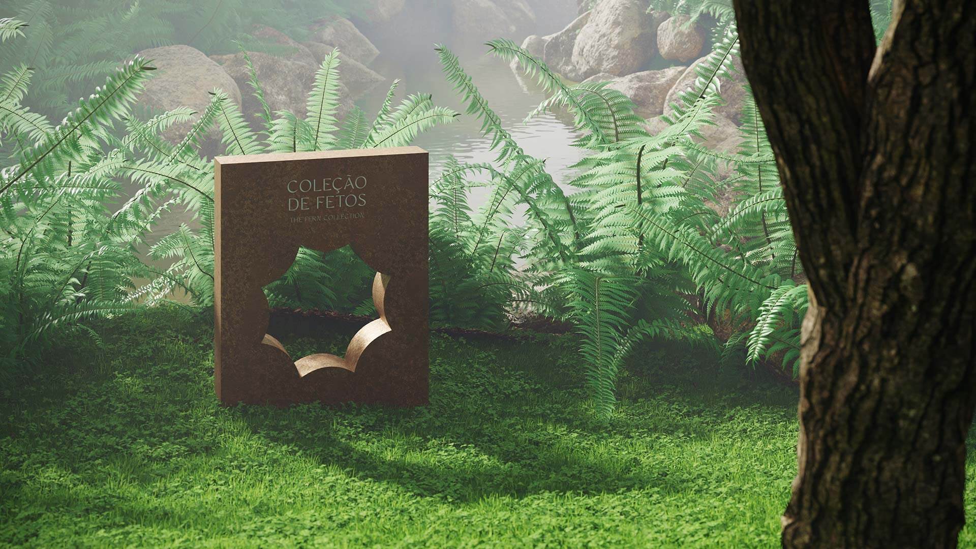
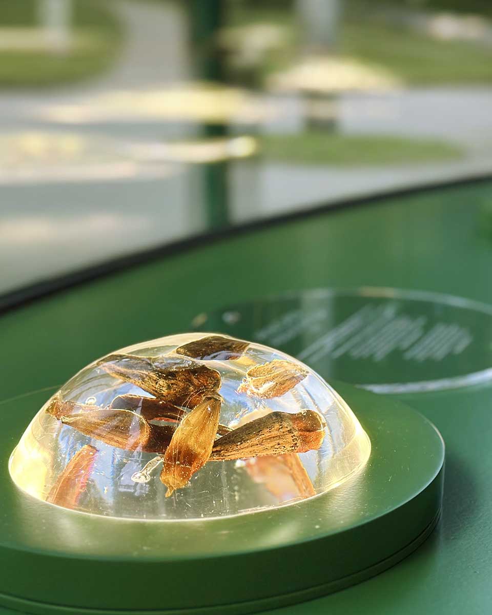
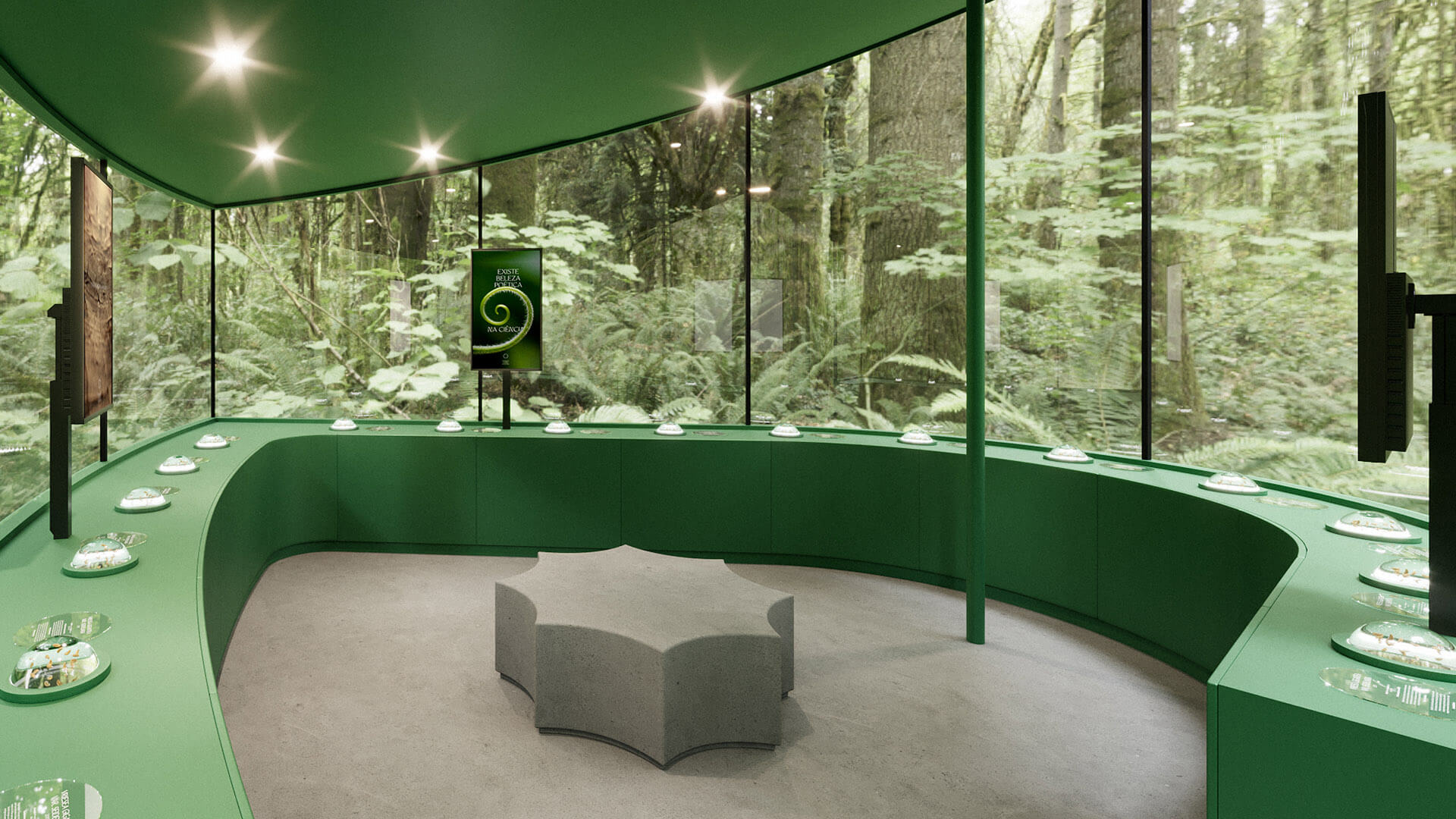
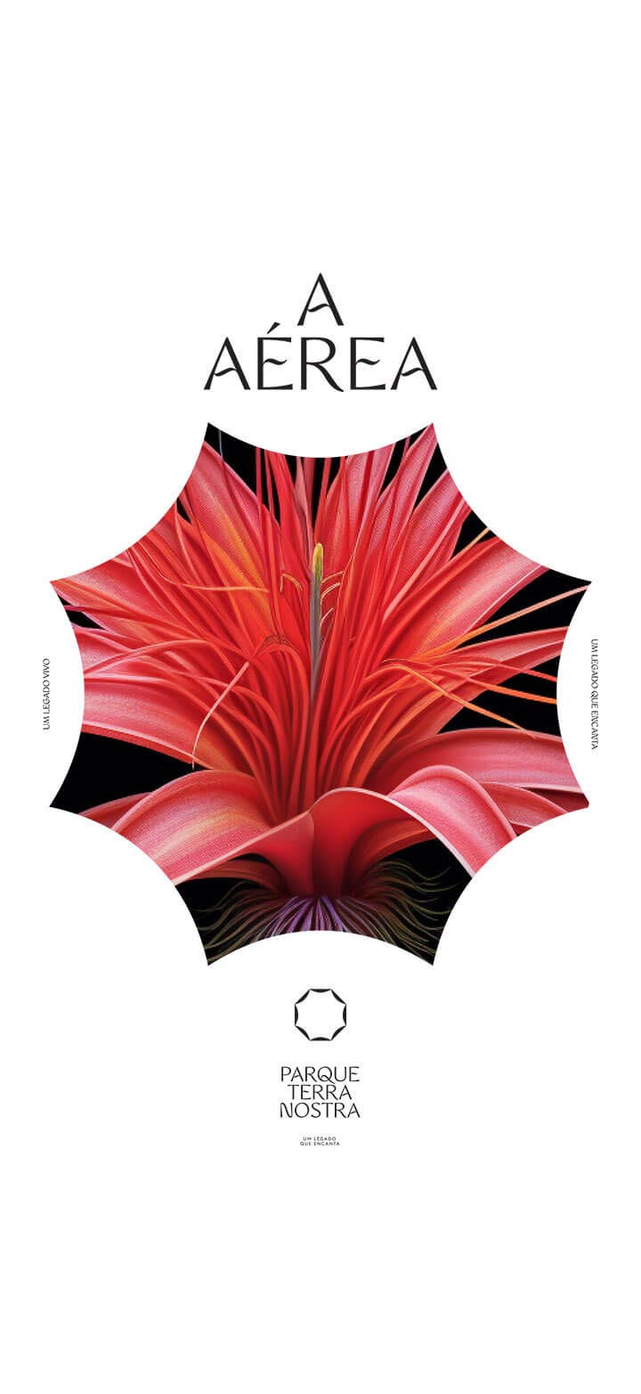
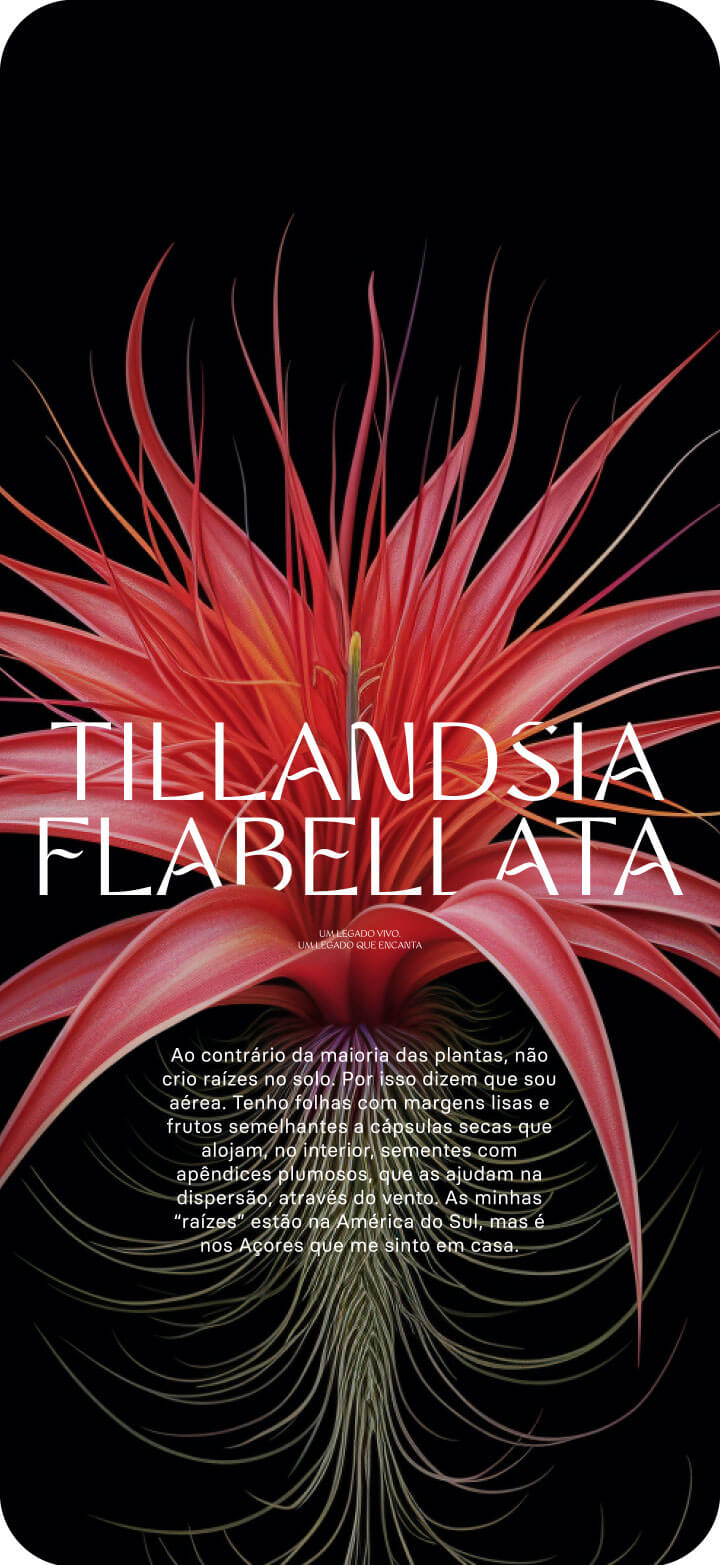
Inspired by the flower petal’s organic essence, the new identity calls out to the botanical nature in place. The stylised shapes refer to the Park’s octagonal architectural designs like the visually striking thermal tank, an iconic reference. Just as a flower opens in every direction, the symbol comes to life and reveals every side of a living and expanding legacy.

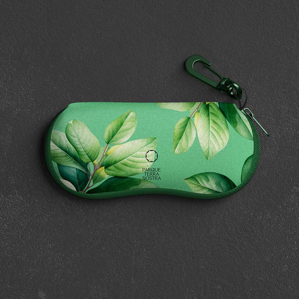
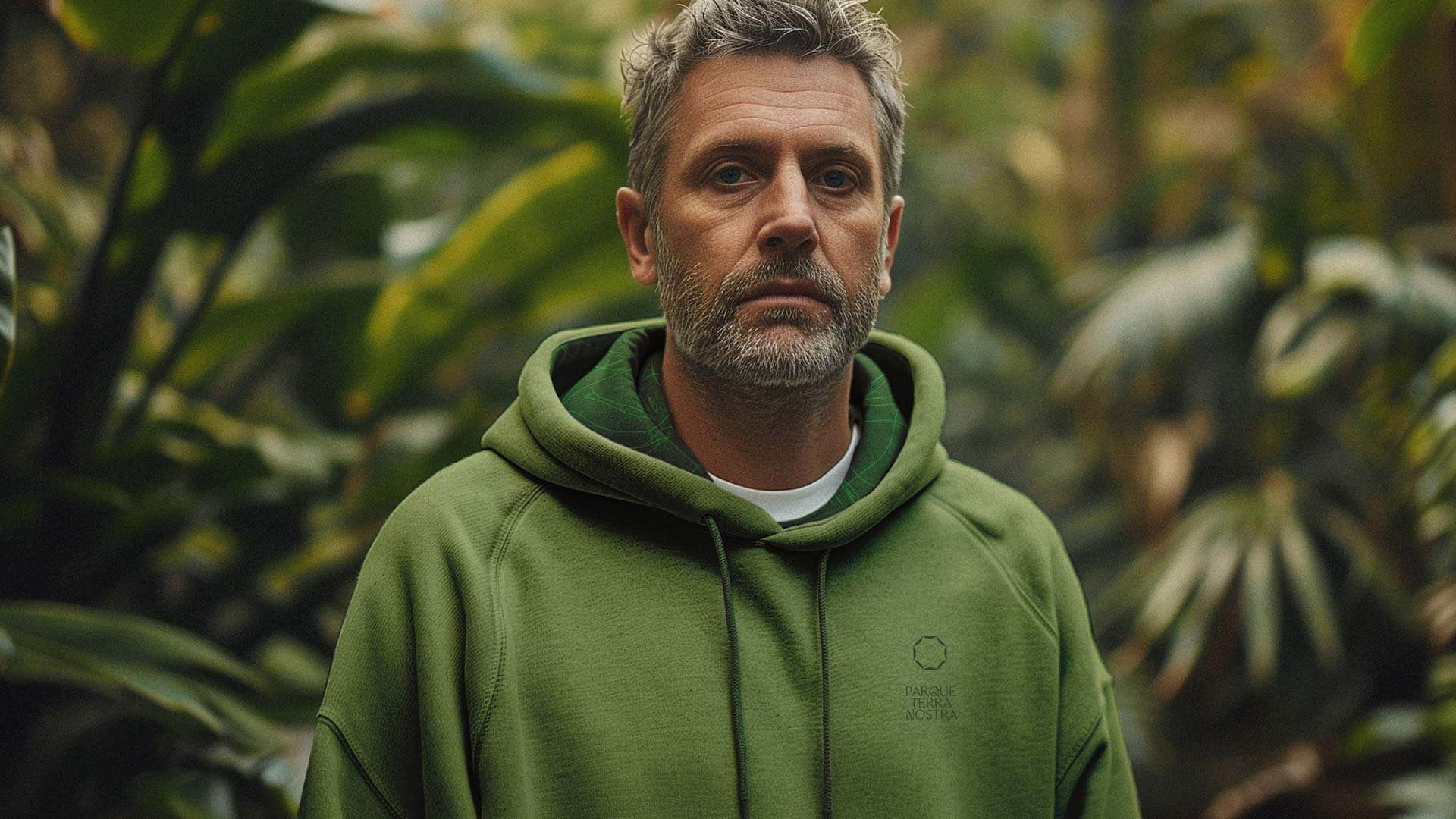
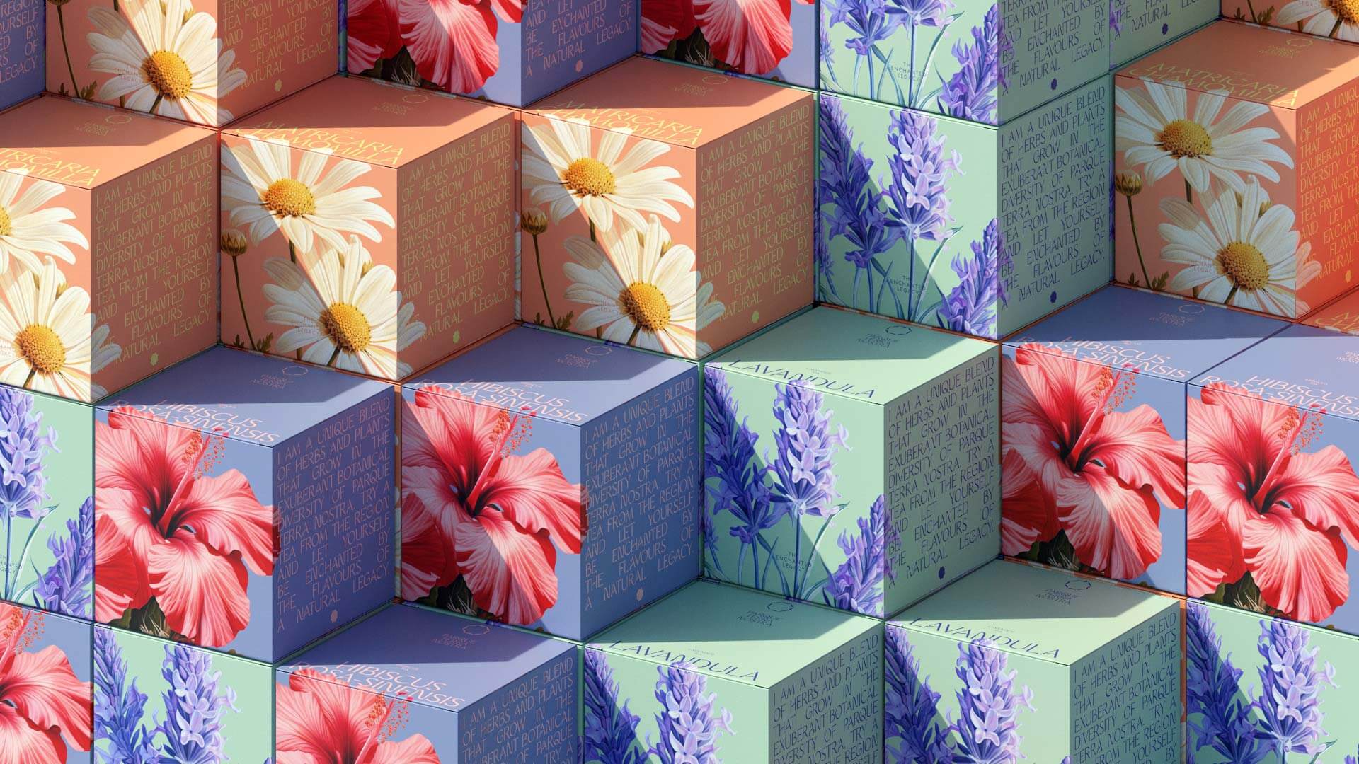
This symbol is only the beginning of an extraordinarily rich brand universe that includes verbal and visual devices that represent the park as an enchanting experience that combines nature, leisure, relaxation and knowledge. The botanical aspect is central and the brand voice expresses itself as a narrator passionate for the stories the plants have to tell, inviting everyone to take part in a conversation with nature.

The new identity was designed to bring out the most important elements: the plants and botanical aspect that directly interact with everyone who visits by telling a story and enveloping each person in a legacy that starts to become their own. Simultaneously the brand values all Terra Nostra Products through a global and ample vision of the Terra Nostra ecosystem.

For this reason, the Terra Nostra Park merges natural history with human history representing both nature, culture and heritage. A partnership between Nature and Man that is meant to be lived and felt as opposed to merely visited. This new identity aims to capture and communicate the rich and diverse life that strengthens the Park’s role as a primary destination for leisure, well being and as a globally relevant sustainable scientific project.
The enchanted legacy.
IDENTITY
The symbol, aside from representing everything that blooms around it withholds all the Park has to offer. The sophisticated and curated design provides the symbol with a natural elasticity that allows the entire brand universe to express and expand itself. With a floral and organic design, the typography complements the symbol’s geometric lines maintaining a sober, timeless and relatable expression.
GRAPHIC DEVICE
From the identity’s symbol, the octogonal shape works as a graphic device bringing a unique brand language to life that becomes particularly relevant in the visual and communication universe. This device helps to frame and highlight the illustrations and photographs that are used in the different means and moments of communication, bringing out the botanical, naturalistic or architectural features.
ILLUSTRATION
Nature and botany are the ex libris of Terra Nostra Park and the stars of its communication. Through expressive and vibrant illustrations that artistically re-interpret nature’s purest forms resulting in an ode to diversity and botanic exuberance through images that come to life through the movement of their own elements like the sound of water and animals. Almost like walking into the Park where everything is alive and brings our senses to life.
LOOK & FEEL
The naturalistic aspect mostly represented by the botanical diversity is undoubtedly Terra Nostra Park’s ex libris thus becoming the star of the new visual language. Our creative approach was inspired by nature in its most pure and authentic state providing the brand with a classic elegance and high end positioning as a real “open air museum”.

The new identity has a realistic expression in its presentation based on photography and illustration where nature is captured in an authentic and spontaneous way. This allows us to enhance all of the park’s elements from the botanical to landscape architectural heritage.

In order to bring this idea to life, a visual language where every element is in constant movement was designed, recreating Terra Nostra Park’s living nature. This motion device when combined with the rich color scheme and precise details conveys the brand with a distinct, unique and personal identity.

The new identity has the necessary flexibility and natural flair to express and expand on the entire Terra Nostra universe creating an emotional and sensory experience with visitors.

The result is a living and breathing visual universe that captures and expresses the essence of Terra Nostra Park. This holistic approach reenforces the importance of nature and the environment whilst simultaneously celebrating the Park’s abundant botanic and cultural wealth creating an unforgettable and involving experience for all visitors.
SLOGAN
The enchanted legacy.
It's the new brand slogan; a legacy of history and the world, of people and nature. A legacy within an experience that will bring new enchanting elements to life like everything that flourishes in Terra Nostra Park mesmerising visitors and giving them a small part of this legacy to take home.
Tipografia principal
With a floral and organic design, the main typography complements the symbol’s linear intent whilst maintaining a sober, timeless and relational expression.
Tipografia secundária
COMMUNICATION
Terra Nostra Park isn’t an enchanted like in fairy tales. It’s a garden that invites us to immerse ourselves into its legacy and enchants us with its tales. In first person narration mode, the Park transforms more complex scientific botanical knowledge and facts into something simple and relatable. The stories plants, water and even stones have to tell invites visitors into a spontaneous and enchanting narrative that reflects the Park’s essence.
MERCHANDISING
Terra Nostra Park’s merchandising was inspired by the brand’s rich and flexible visual universe through several of the brand’s graphic expressions creating distinct merchandising lines from commercial to more sophisticated. Each product tells a story, each item captures an experience, involving visitors in a legacy they can easily make their own. Those who are taken take a piece of this legacy with them.
The Terra Nostra Park merchandising collection isn’t just a handful of products for sale but an extension of the Park’s experience, allowing visitors to take a part of the park’s beauty and enchantment home with them.
GRAPHICS
The graphic options available secure a variety of different styles from modern and sophisticated to classic or traditional targeting different age ranges, sex, tastes and lifestyles aligning with diverse price ranges adjusted from impulse purchases to premium products.
CHILDREN’S LINE
For children we designed a collection immersed in from a child’s imaginative perspective. We wanted the collection to work as an extension of the experience younger visitors have with a re-interpretation of the shapes, colours and smells that make up the imaginary universe created from the Park’s zoomorphic sculptures.
ICONOGRAPHY
The iconographic language has the symbol as its starting point, ensuring a direct connection to the brand. Its premise is the straight and curved side of the symbol, in a balanced, human communion with its surroundings.
SIGNAGE
Like a portal open to enchantment, the Park’s signage frames nature itself in its device.
ORIGINS ROOM
The Origins Room is like an entrance hall of knowledge about Terra Nostra Park. A gallery that protects the Park's most precious asset through a selection of seeds that tells the story behind each species. The Origins Room is, on the one hand, a celebration of biodiversity with high scientific and sustainable value and, on the other, an ode to the natural beauty and botanical wealth within each species, flower, plant or tree, that must be nurtured and preserved as the Scientific (that which explains) and Poetic (that which enchants) essence of each universe merges with the other. The Origins room is also a brand experience, where its Manifest comes to life through film.
SOCIAL MEDIA
The brand’s social media strategic and creative guidelines are also part of the project. Instagram is the preferred platform due to the large number of users that prioritise visual content which is in effect the best way to communicate the Park’s multiple experiences. The Park’s feed is also a first person narrator taking us back in time, enchanting season by season and inviting us to share, delve and be a part of this legacy.
Inspired by the past and guided by the desire to project Terra Nostra Park’s full potential in its legacy for the future, we were delighted to bring this enchanting new brand to life. A human brand by nature whose nature leaves a legacy that enchants.


Next project